Gerrymandering Is Anti-City. Let's Fix It.

Note: this piece is adapted from, and expands on, my recent video on House apportionment, gerrymandering, and structural pro-rural bias in our congress. It's not strictly necessary, but you might want to watch here on Nebula, or embedded below on YouTube (with ads and sponsor content, though). If you already watched, and the video is what brought you here, feel free to skip ahead to the bonus material at the end, which covers the 50 states + D.C.
Gerrymandering. You know it when you see it. Hideous, geometrically tortured congressional districts, designed with just one goal in mind: to dilute the electoral power of people who don't vote the way the mapmakers want them to. I'm not really a "both sides" person, but it's bad no matter which side does it, and yes, when we get to the final reveal, it will be clear: both sides do it. Also, gerrymandering has turned into an arms race that, in the run-up to the rapidly approaching 2026 midterms, has gotten more nakedly political than at any point I can remember in my lifetime.
Why are you making it political?
So, hold up, you might say. I come here for information, analysis, and poorly constructed jokes about cities and transportation. Why are we talking about congressional apportionment, or really, anything political at all? Well, first of all, urban planning is always, always, ALWAYS political. And today's piece flows from what I think is a pretty self-evident premise: that the way House districts are drawn is deeply important to the way our cities are represented, or NOT represented, when it comes to the policymaking that impacts them.
Here's the game plan. I'm going to propose some changes to (1) the way House seats are apportioned, and (2) the way redistricting is done. There's a lot of explanation required and a lot of detail to get into, but when we're done, we'll have maps that, I think, make things more fair for city dwellers and rural folks alike.
Want new content in your inbox as soon as it publishes? Consider subscribing! (And paid is great if you can swing it!)
Baseline conditions: the House today
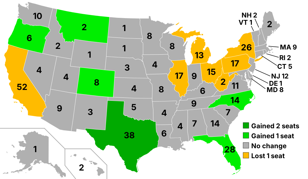
Right now, there are 435 seats in the House of Representatives, and those get apportioned to the 50 states, basically proportional to population, with each state getting at least one. Why 435? Well, that's an important and interesting question that...I'll come back to in a bit.
Then, each state government is responsible for drawing a map with one district for each seat, and each district has to have a roughly equal population. The process as it exists today is, with few exceptions, nakedly partisan, with whoever's in control of state government designing a monstrosity that maximizes the likely number of seats for their own party. You might have seen this example before:
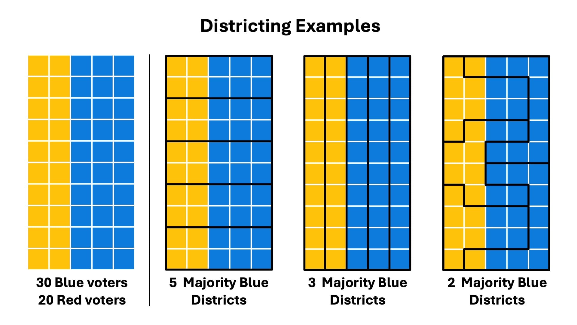
With a population of 50 that's 30 blue voters and 20 red, you can make 5 districts of ten voters that are all majority blue; you can make a map that's "proportional," meaning 3 blue districts and 2 red; you can even make one where the minority comes out on top: 3 red districts and 2 blue. This is how you get absurd stuff like the Texas map, which packs as many of Austin's left-leaning voters as possible into one district, and then dilutes the rest into gruesomely shaped surrounding districts.
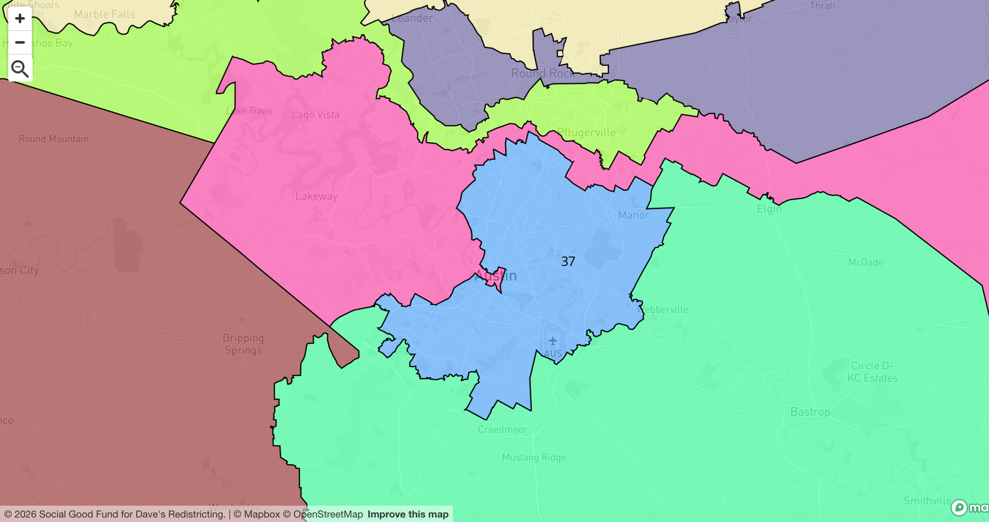
(Brief but necessary aside: nearly all of the districting graphics in this piece, and some of the analysis, come from the amazing Dave's Redistricting site. It's a great resource for learning more about existing congressional maps, and has all kinds of tools that allow you to try drawing your own. Highly recommended!)
A couple notes here. The allocation of seats, or what's called "apportionment," happens every ten years and is informed by the decennial US census. (In fact, it's fair to say that the very reason the constitution requires a decennial census — a resource that's indispensable for all kinds of analysis I do on my channel! — is House apportionment.) Some very basic math will tell you that the combined population of the 50 states, divided by 435, comes out to around 761,000 people per congressional seat.
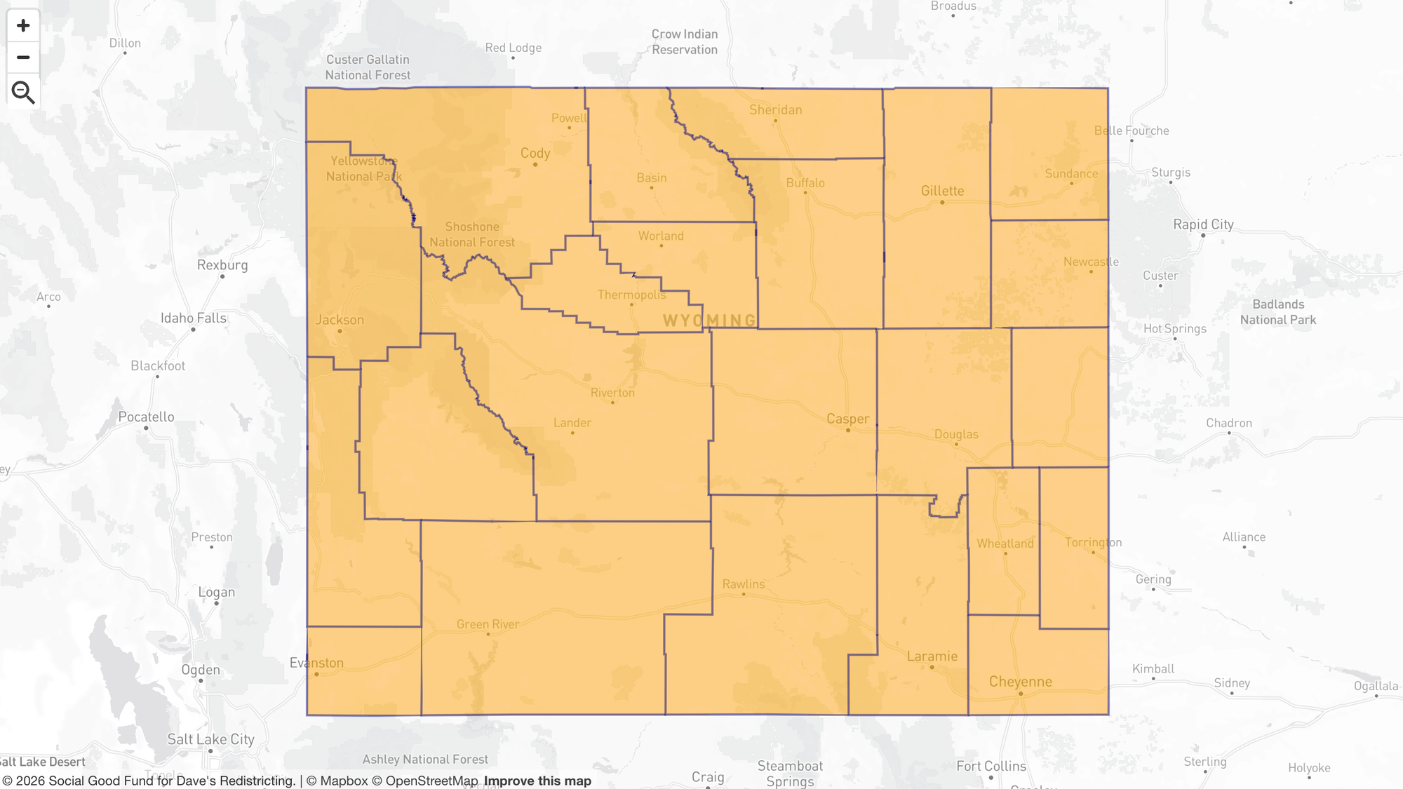
But the population per district varies a lot. Remember, Wyoming, population 578,000, is guaranteed one seat. Delaware, almost a million: also one seat. But as states get larger, with more districts, that number converges on 761,000.
But...why 435?
Now, it used to be that, when House seats were reapportioned among states every ten years, the number of seats in the house also increased. When the first apportionment was done after the 1790 census, there were 105 representatives; and then the house grew as the nation grew. Seems logical (within reason — those 105 each represented about 30,000 citizens, but if we kept those same proportions today, we'd need a House with over 10,000 seats!).
Let's fast forward to 1920, though. Republicans control the White House and both chambers of congress, but when the 1920 census numbers come in, what they see is rising immigration and a population migrating from the countryside into the cities. Not good news for the ruling party: smaller rural states are losing representation to larger urbanized ones, so they simply decide not to reapportion at all, and leave the number of seats at 433. Then, later in the decade, we get The Permanent Apportionment Act of 1929, which caps the number of seats at 435.
Just think about this for a minute. We already have the Senate, which allocates two seats to each state, regardless of population. So the people in our large urban states already get penalized: if you live in California, you get one-seventieth, or 1.4%, of the Senate representation that someone who lives in Wyoming does. It's infuriating, but for today, I'm not trying to tackle (dissolve?) the Senate. We're going to leave it to the side. But the House of Representatives? The whole point of the House is, it's meant to be the people's house. The Senate is an irredeemable, inequitable albatross on federal governance, but in the House, humans get proportional representation. That's the theory, at least, but the Permanent Apportionment Act basically says, no matter how much population shifts from small rural states to large urban ones, we're going make sure the smallest states still get disproportionate representation.
Step One: Repeal
So, our first action item is to repeal the 1929 act, and instead implement what's called The Wyoming Rule, which establishes the population of the smallest state as the standard unit for sizing congressional districts. That means more House seats, which I think in itself is a plus: it means we get a House that's more granular — one that allows us to more precisely match representatives with districts that have unique contexts and interests along the urban-rural continuum.
Step Two: Rationalize Redistricting
Now, it doesn't do much good to give proportional representation to more heavily urbanized states if state legislatures are just going to turn around and create insane maps that maximize partisan gains. Yes, we have to tackle...gerrymandering.
Now there's been all kinds of research, and all kinds of algorithms developed, that focus on things like minimizing median district size, maximizing competitiveness — you name it. You can absolutely go down a rabbit chasm exploring the mathematical side of redistricting (and probably have a lot of fun doing so). But I'm more interested in focusing on first principles, establishing what I think are some common sense ideas, and keeping things as transparent and un-black-boxy (not a word, but should be) as possible.
575 Wyomings
So here's my starting point: as of the 2020 census, the population of the United States amounts to 575 Wyomings, so that's the new size of the House of Representatives. And yes, I made an executive decision to include Washington, D.C. since, last I checked, the population of the U.S. includes D.C. residents. As far as apportionment, we're going to do it the same way: to each state, proportional to population. (Actually not quite as straightforward as it sounds; here's a primer on different approaches, including the highly useful Huntington-Hill method, if you're interested.)
Uncapping the House ("step one") and setting the number of seats at 575, all by itself, doesn't do much to address the urban-rural divide, other than adding some granularity and locking a handful of states like Wyoming and North Dakota at one seat while basically every other state gets more. We also need step two: the establishment of some principles around what districts look like. And the idea is, instead of drawing ridiculous, tortured boundaries that force urban residents to share representation with rural residents who, in all likelihood, don't have political views or policy priorities that are even remotely in the same universe, we should draw districts that maximize the ability of citizens to choose representatives that actually represent their views.
How NOT to redistrict
Before we talk about what a better approach might look like, let's look at some bad ideas, because there are a couple pieces of redistricting conventional wisdom you'll often see implemented that I just don't think make any sense at all.
One is the idea that you should try to create "competitive districts," meaning, districts that have similar numbers of Democratic and Republican voters, and that you do this by drawing boundaries that include some combination of urban, suburban, and rural that get you to the desired balance. I just think this is misguided. All it means is, nobody in the district really gets what they want. Yes, a lot of politics is about compromise, but I think it should be our representatives in congress who are out there negotiating with each other, horse-trading, and finding common ground. I don't think constituents themselves should have to do that.
Instead, here's an idea: give people the chance to choose a representative who's maximally aligned with their interests. I think having urban districts that aren't diluted by needless gerrymandering into rural areas, and vice versa, give us the opportunity to have maximum diversity in the political discourse, and have a House that actually reflects the wide spectrum of political and cultural values that exist in our country. And I'm sure there are arguments against that, and that we'd be somehow better off with 435 moderates in congress, but I simply think that view gets our country completely backwards.
Proportionality: a wild goose chase
The other idea I want us all to disabuse ourselves of is this: that the proportion of nominally red districts or blue districts in a state should be proportional to the percentages of each kind of voter. Meaning, say, if a state has ten districts and the vote split is 60-40 Republican, then that state should have six red districts and four blue districts.
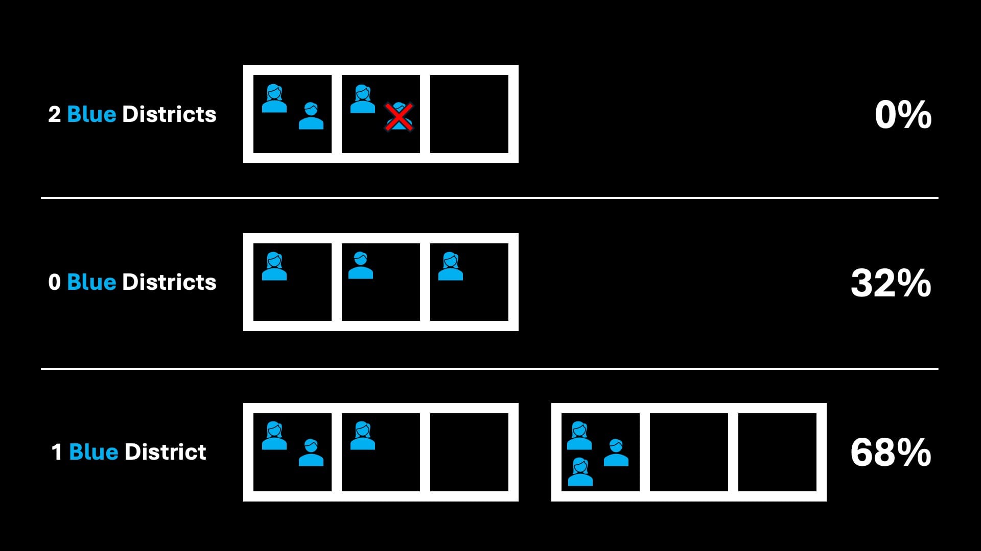
It turns out it's nearly impossible to do this, and to even try to accomplish it you have to do some incredibly unnatural things with district boundaries. The simplest way of explaining this is, say you have nine voters, split evenly among three districts, so, three voters per district. Six voters are red and three are blue, so therefore, you might say, two of the districts should be red and one should be blue. But mathematically? It just doesn't follow.
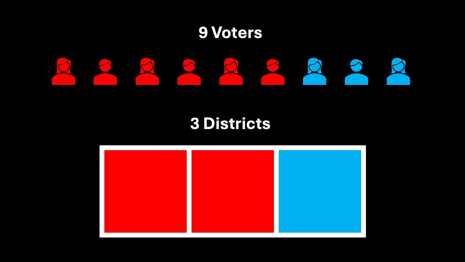
In reality, if you randomly assign the voters to districts, well, first of all, it's impossible to get two blue districts, because you'd need four blue voters in order to get the needed majorities. Then, there's about a 32% chance that your three blue voters will be evenly split, one per district. So, only 68% of the time will you get even one blue district, and therefore, your expected blue districts wouldn't be 1.0, but 0.68.
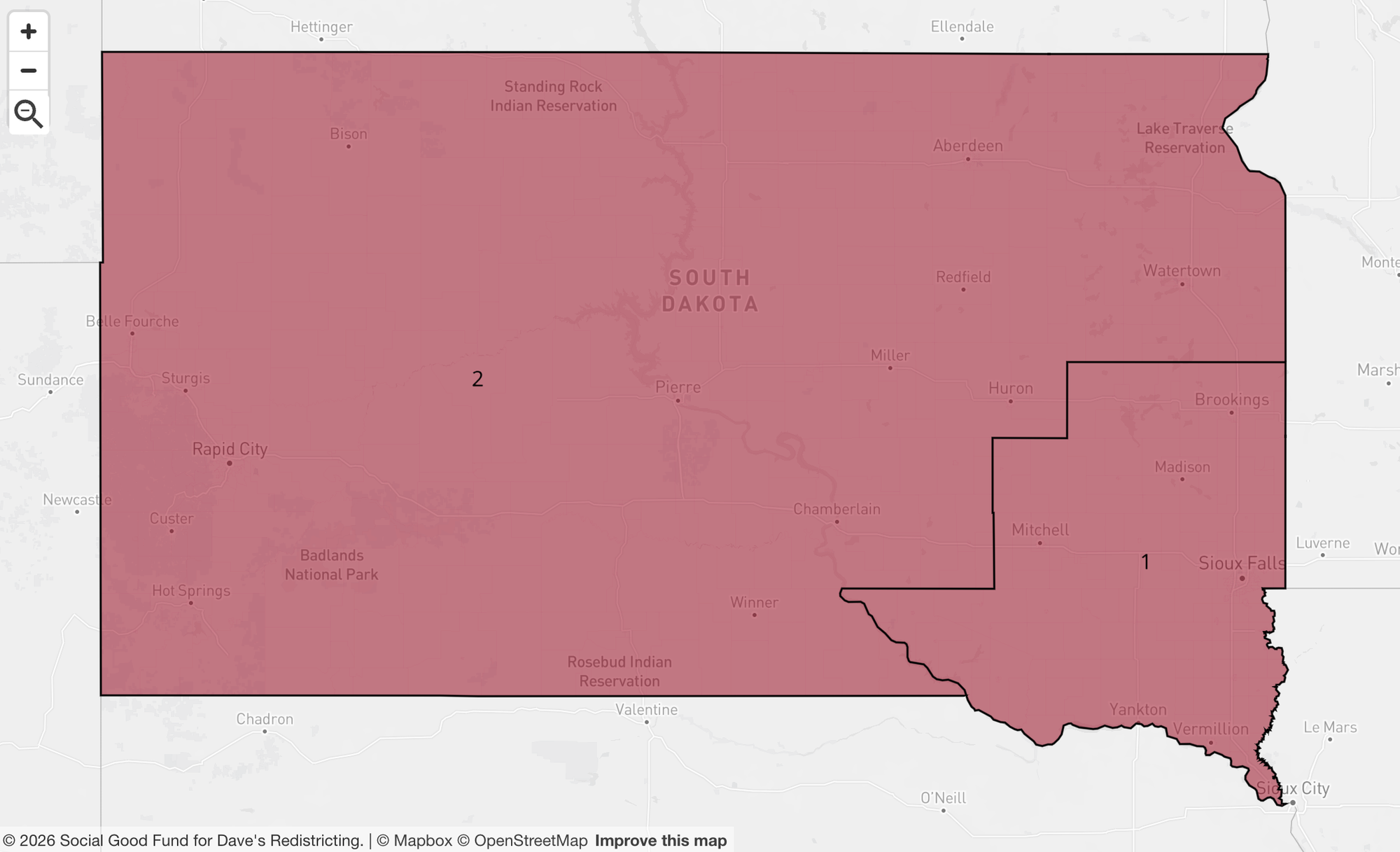
How this dynamic plays out varies by state, but it's pretty consistently the case that the breakdown of House seats has an even more extreme partisan lean that the state's electorate itself. A simple example is South Dakota, which gets a second district under the 575-representative plan. South Dakota has a partisan lean around 37% Democratic, so you might say, well, 37% is closer to 50% than it is to zero, so therefore there should be a Democratic district. But I defy you to draw any kind of reasonable South Dakota map that gets you anything other than two R districts.
You know what, though? I think embracing the realities of probability and letting go of the idea of proportionality is...OK. It's just math. In some states the math benefits one party, and in some it benefits the other. And nationally? It all ends up being a bit of a wash.
Drawing districts that aren't ridiculous: a method
I think there's wide agreement that gerrymandering is ugly, both aesthetically and morally, and it needs to be addressed. But coming up with a rational method for drawing districts, especially in high-population states with lots of different urban-rural contexts? Actually not as straightforward as you'd hope.
Here was my basic approach. I wanted urban districts (and sometimes suburban ones, given a large enough metro area) where they made sense, with whatever's left over getting carved up into rural districts of equal population in the most spatially pleasing way possible. I didn't come up with a precise mathematical algorithm for doing this, but I have no doubt there's someone out there who's smart enough to code the hell out of this. The steps for each state, generally:
- Select the county with the highest population (this is usually the most urban county)
- If the county's population is greater that the target district size for the state, create a district centered on the densest part of the central city. Continue carving new districts out of the county until you have a remainder less than the target district size.
- Move on to the second most populous county, and repeat Step 2.
- When you reach counties with population below the target district size, attempt to draw districts by incorporating abutting counties, or the nearest parts thereof.
- At a certain point, you're down to largely rural counties, and you're simply assembling them into logical shapes that meet the target district population. At all points, attempt to keep whole counties intact as much as possible.
(It's actually a bit trickier than this — you have to be careful not to land lock or sequester an area that's below the target district population size, because districts have to be contiguous. So, for example, you really have to start on the east end of Long Island and work your way inward if you want to stay out of trouble in New York.)
You might note that the approach treats lower population, rural counties as "leftovers," and while that's literally true, it's not intended to strip electoral power away from rural constituents. Quite the opposite, in fact! I mean to be fair, they generally have the senate working in their favor, but also, I think they should be entitled to their own House representation, in their own districts, undiluted by woke city slickers...just as the converse is true.
(Also, note that something I haven't done here is any kind of Voting Rights Act analysis, but I suspect that my approach increases the prevalence of majority-minority districts just by the nature of concentrating the urban vote rather than diluting it. More on this in the state-by-state breakdown that follows.)
The most partisan districts
Dave's Redistricting calculates the partisan lean of counties, cities, precincts, and, of course, every district you draw. There were all kinds of interesting findings as I went through the districting process — a lot of those findings embedded in the state-by-state review that follows — but one of the most interesting was looking at the bluest and reddest of the 575 districts I drew. Given my approach (clearly defined urban and rural districts), I expected heavy partisan leans in both directions all over the map. The way it actually played out, though, was a bit shocking.
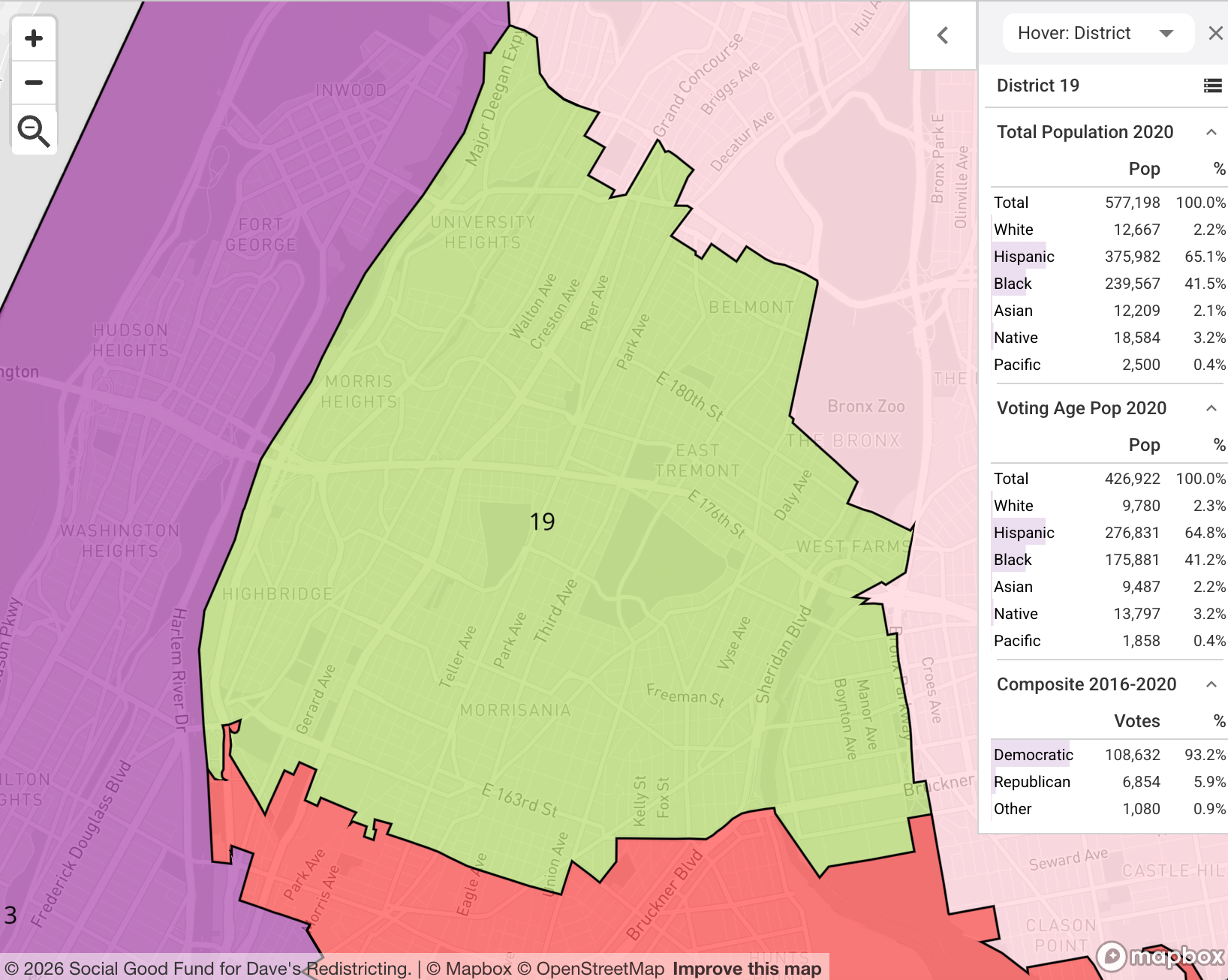
The most heavily Democratic-leaning district was New York's 19th, which covered what was left of the South Bronx after the general domino effect of working inward from the east end of Long Island. (I would have preferred to keep all of the South Bronx intact as much as possible.) NY-19 has a 93.2% D lean. There were actually seven districts nationwide with a D lean over 90%, and thirty overall with an 80%+ blue lean.
The district with the heaviest Republic lean? Georgia's 14th district, comprising several counties along the north edge of the state — Marjorie Taylor Greene country, more or less. It's fair to think of this as deep red, but note it falls just short of 80% Republican leaning, at 79.7%. Just to reiterate: 30 districts with an 80%+ D lean, zero with an 80%+ R lean.
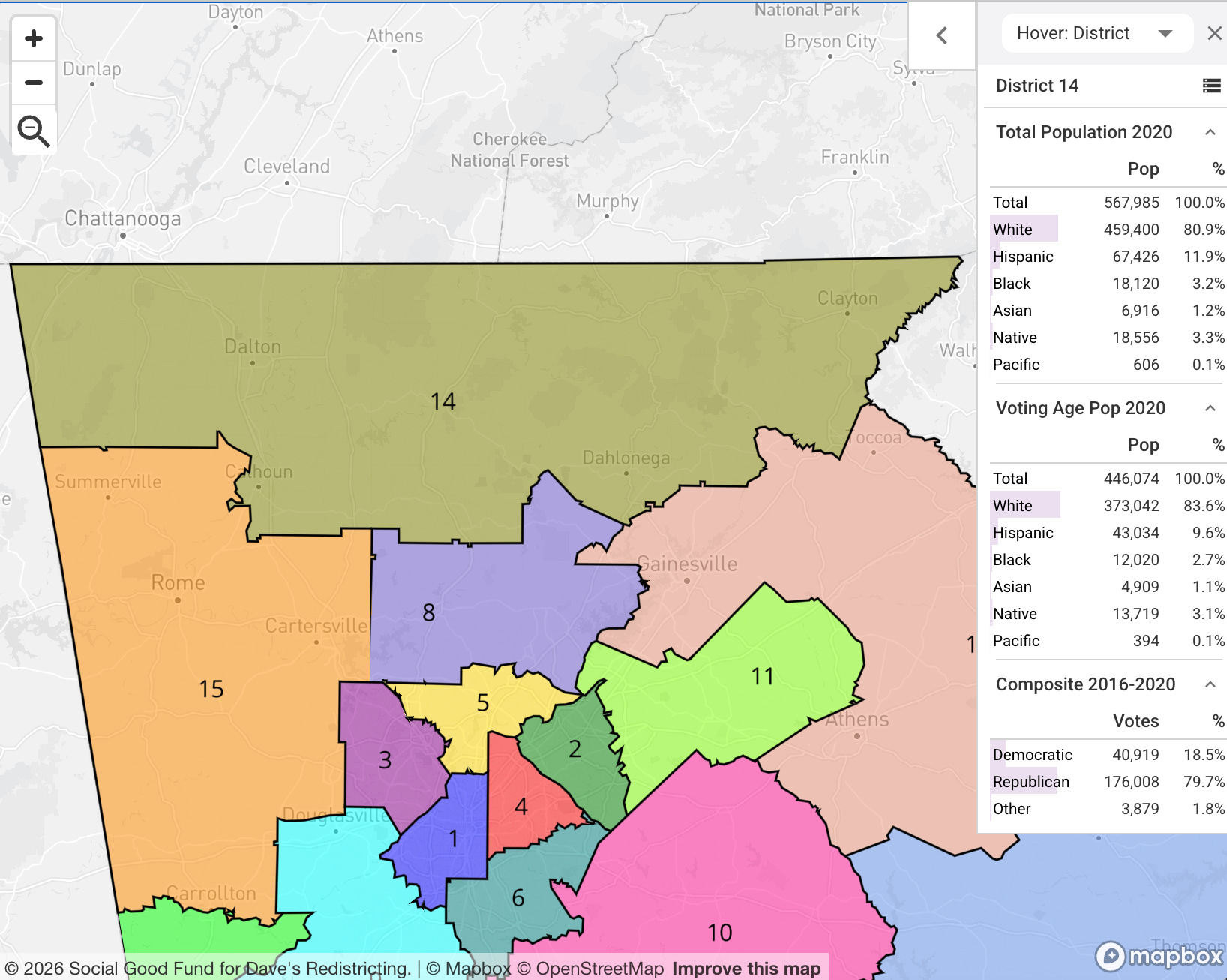
Again, I put plenty of effort into combining low density rural counties into districts, in just about every state in the U.S., and still, even in the reddest districts, something like one in five voters is voting blue. Just something to consider when you hear pundits talk about "Red America" as a monolith.
The bottom line, if you must know
The point of this whole exercise was really to create districts that try to, as much as possible, group together voters who have shared interests — districts where the most interesting competition will often be in the primaries, with the general election a bit of an afterthought. If you've been paying attention to politics at all in the last couple years, this should excite you. But, I'm a realist. I understand some people are going to be chomping at the bit wanting to know partisan outcomes, so let's take a look.
First we need to establish the baseline political makeup of the country. Based on the state-by-state partisan lean documented in Dave's Redistricting and applying population weights, it's something like 49.7% Democratic, 48.2% Republican, and 2.1% other. Pretty evenly split, but the current map of 435 congressional districts, given recent gerrymanders, implies a 226-209 Republican advantage. That's given a neutral political environment, which is not the norm in any case, and certainly not in late 2026. Districts that have a 55% generic R lean — and there are many — will be Republican locks in some elections; in 2026, they're likely to be pretty competitive.
But, it's fair to say the House map that exists today is not tilted in Democrats' favor. So now let's look at the results for the map of 575 Wyoming-sized districts I came up with using the method described above (and illustrated state-by-state below). The final tally: 296 blue to 279 red. Surprisingly, given how my method packs heavy majorities of Democratic voters into geographically small urban districts, the overall map ends up having a slight D bias. (Given the nationwide partisan lean of 49.7% to 48.2%, it should be more like 292 to 283 — so, not really that far off.)
The bottom line? A nationwide House map that's closer to the overall partisan makeup of the country, that's more granular, and that allows voters in different urban, suburban, and rural contexts to elect representatives that better match their values. Seems good! So let's uncap the house, and draw districts that give people what they want.
Appendix: State By State
Going state by state, using the approach outlined above to draw 575 congressional districts, while attempting to keep district populations equivalent down to the voting precinct level is...pretty time consuming. But also, it ends up being quite a bit of fun, and very educational (usually at the same time)! Here are the state-by-state redistricting results, including likely Democratic and Republican seats and some insight on how the proposed maps improve on (or potentially make a hash of) the currently adopted ones.
Alabama
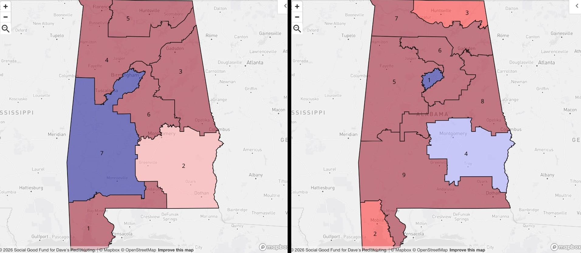
I won't spend much time in these comments analyzing partisan shift, as a lot of it is obvious from the maps themselves, and to my mind it's downstream of the entire idea of constructing urban and rural districts. Alabama retains a solidly blue district built around Birmingham (metro area around a million) in Jefferson County, but in the proposed map it's much more tightly focused. Mobile and Huntsville anchor districts 2 and 3, respectively, and Montgomery is too small to claim its own 558,000-person district, but its voters have strong influence over District 4. Districts 5 through 9 are largely rural, but absorb what's left of Jefferson County after District 1.
Alaska
Alaska remains at one House seat (likely D 0.07).
Arizona
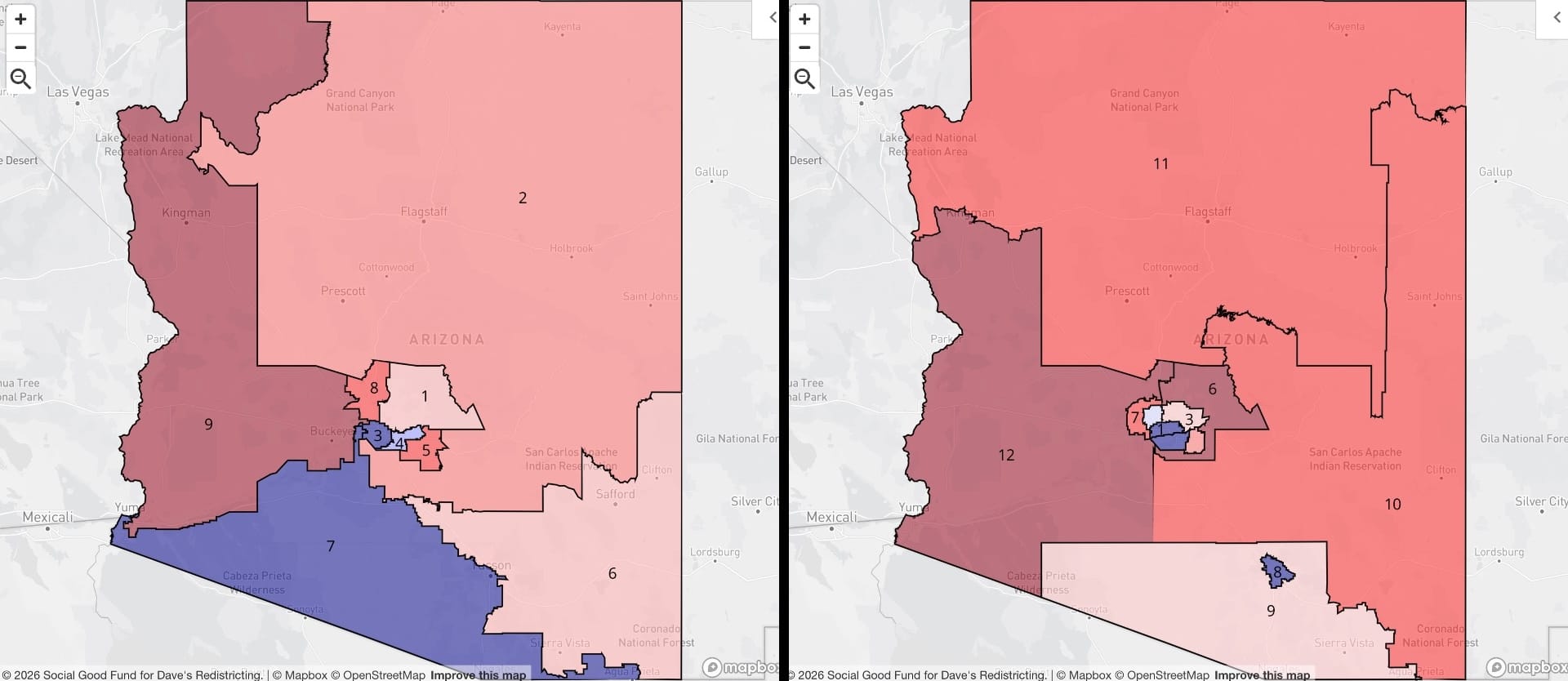
This might be a case where cramming blue voters into small urban districts isn't your best strategy if you're trying to maximize for Democratic votes. (Which I'm not.) Let's start with some good news: we've managed to create a solidly urban district in Tucson (metro area of around a million, well over Arizona's 596,509 districting target) — meaning the most urban part of Tucson now has its own advocate in the House. Exactly the point of this whole effort!
Phoenix is more complicated.
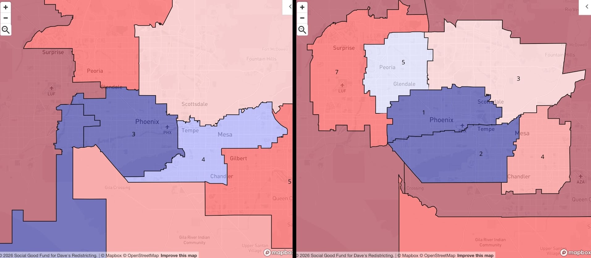
This is the granularity I was talking about. Instead of two dedicated urban districts, Greater Phoenix now has six, covering a wide variety of urban and suburban contexts and interests. Good for the Arizona Democratic House delegation? Unclear. Good for the Valley of the Sun? I'm thinking yes.
Arkansas
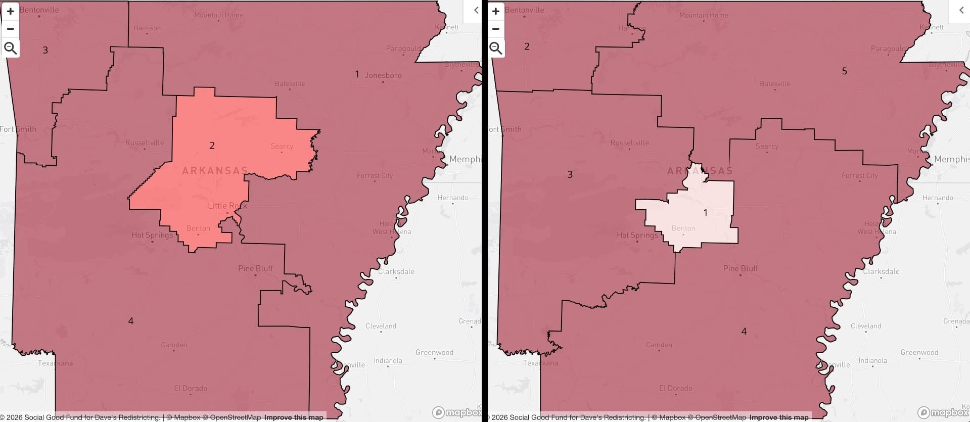
At first glance these look kind of similar: one district at the center anchored by Little Rock, a second district in the northwest anchored by Bentonville/Fayetteville, and the rest consolidated into rural districts. But if you look closer, the adopted map chops off parts of the Little Rock metro area and puts it in districts 1 and 4; the proposed map keeps Little Rock (and all of Pulaski County) intact, creating a new, smaller district that's highly competitive (and more invested in Little Rock).
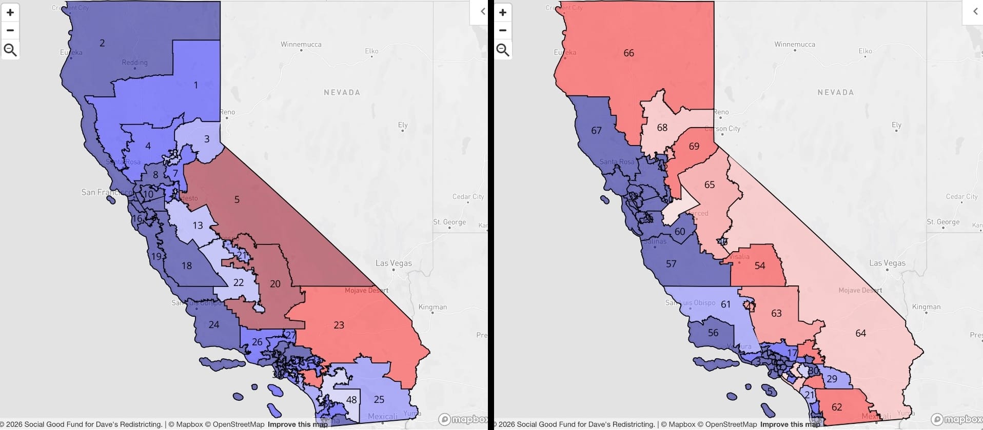
California
On the left is California's voter-approved, adopted congressional map — Democrats' biggest salvo in the recent redistricting wars. I understand why this map exists. I even approve of it on some level, given that we now apparently live in a world where the most brazenly political tit-for-tat is required in order to preserve whatever remains of democracy, and what Texas and Florida did with their maps (more on that later) required some sort of response. There's no doubt, though, that it's an awful map. No red district in northern California, really? State of Jefferson, anyone?
So the proposed map of 69 districts is a step back for partisan gerrymandering, but it's a step forward for better granularity and more coherent city representation. Let's check out the key locations.
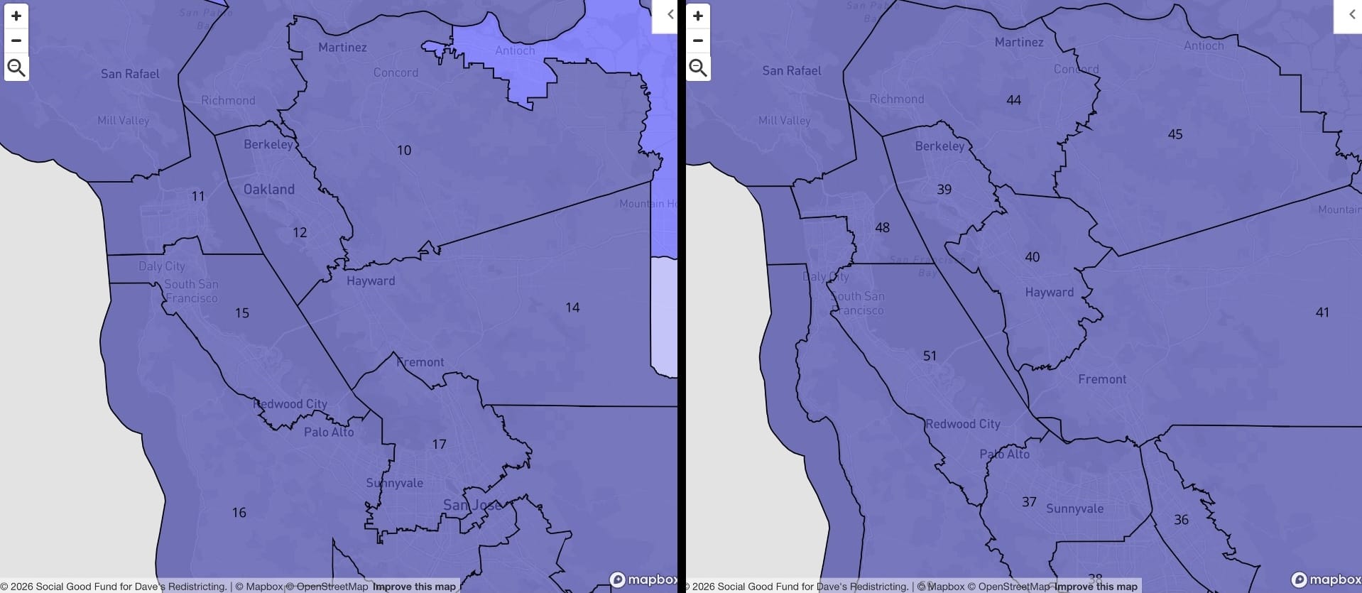
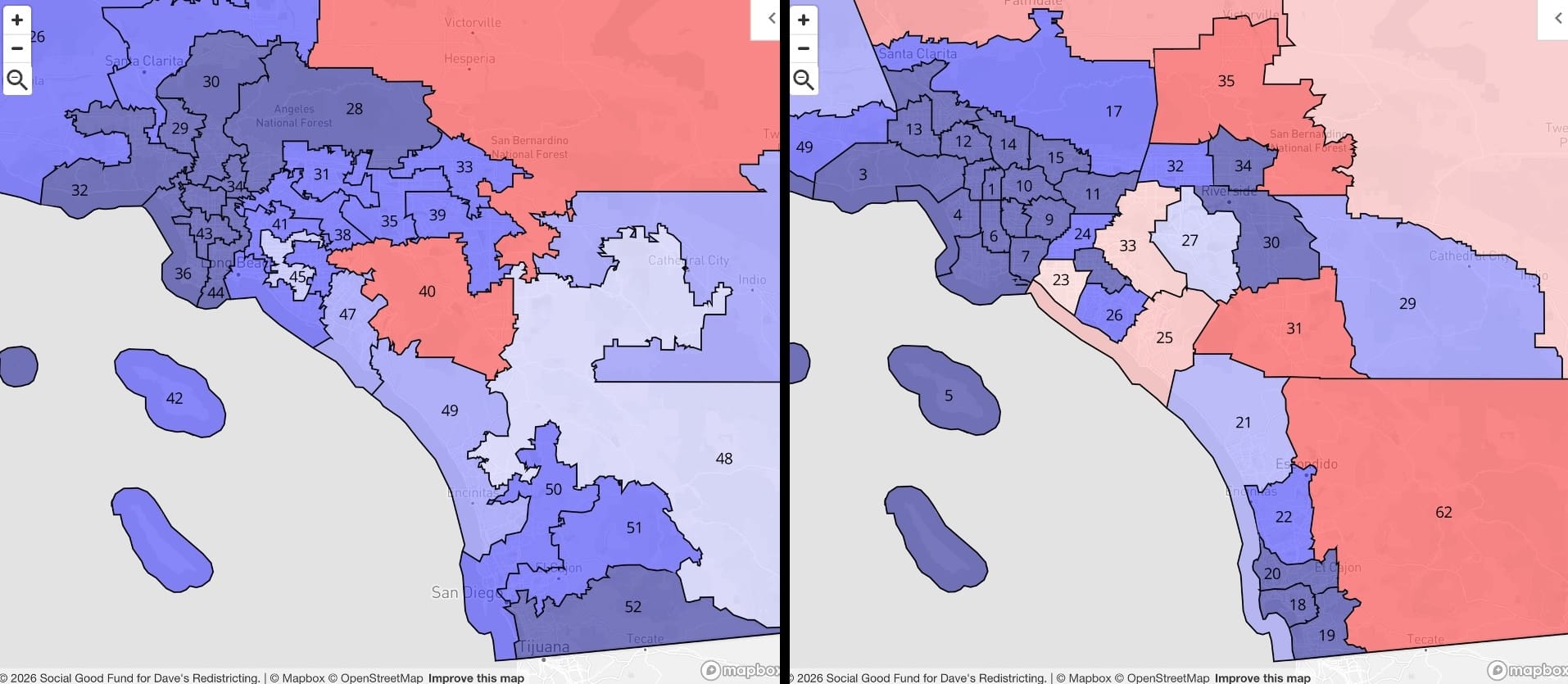
Not that much really changes as far as the partisan lean of the districts. The Bay Area is tricky to carve up because of physical constraints, so the main change is just a bit more granularity in the East Bay. I'm really happy with SoCal, though. Look how much better the definition is in the city of L.A! Also, San Diego gets its own well-defined districts, including the new CA-18 for the central and most urban part of the city.
Colorado
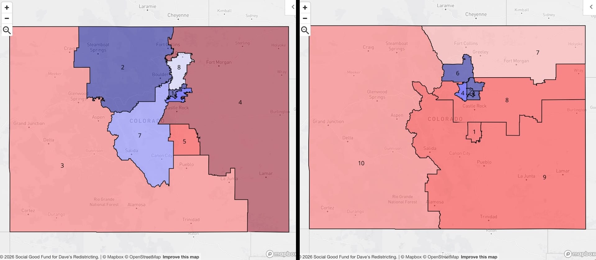
This looks like a state that gerrymandered a bit to manufacture competitive districts, which I don't think is a worthy goal. (I can't really come up with any other rationale for the existing CO-08, or CO-07 for that matter.) The map I've come up with is maybe a bit more rational (debatable), but Colorado ends up being such an interesting state for this kind of exercise. The Denver metro area spreads across a weird amalgam of counties, so it's actually El Paso County, home of Colorado Springs, that's the largest and earns the CO-01 designation. (Also, notably right-leaning for a 500K+ urban area!) Denver/Boulder ends up getting five fairly compact districts under the proposed map (as opposed to the two they get today to accommodate some apparent gerrymandering), and CO-07 through 10 carve up the rest of the state.
Connecticut
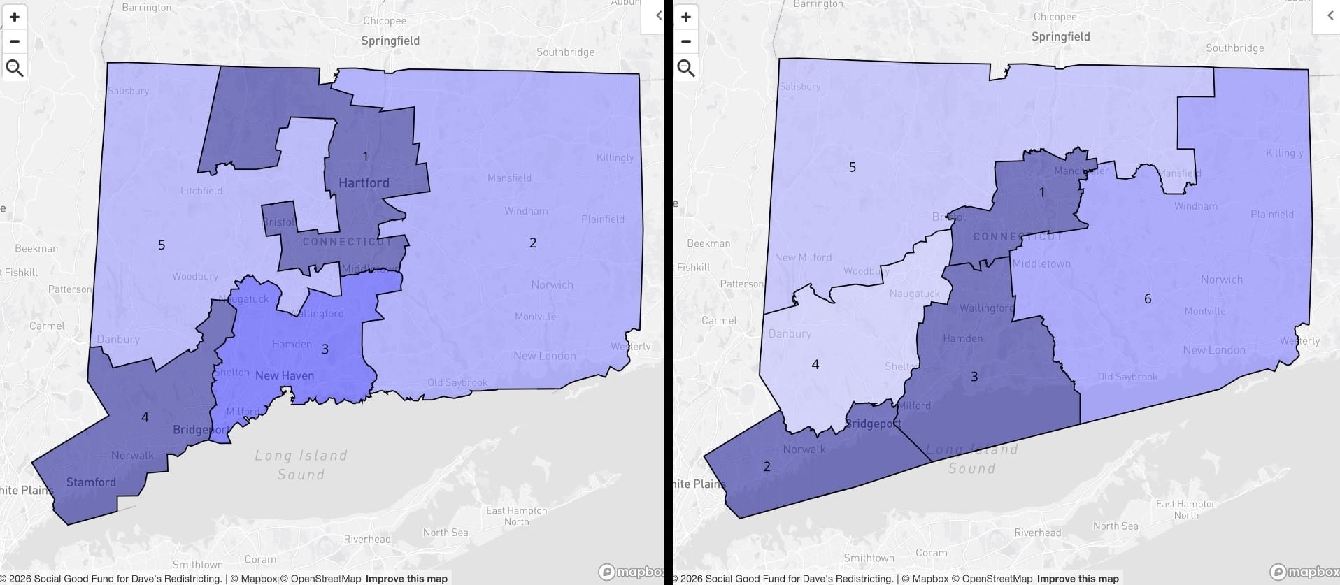
I get the sense Connecticut is slightly gerrymandered to get five seats as safely blue as possible. Leave alone the suspicious shapes of existing CT-01 and CT-05 (left); when you go through the exercise (right) of making compact urban districts around Hartford, New Haven and Bridgeport, you end up with a remainder that consists of sparsely populated areas and...like, Danbury. So, you get smaller districts around the three main urban centers in CT-01, CT-02, and CT-03, and you get a CT-04 that will absolutely be competitive every other November.
Delaware
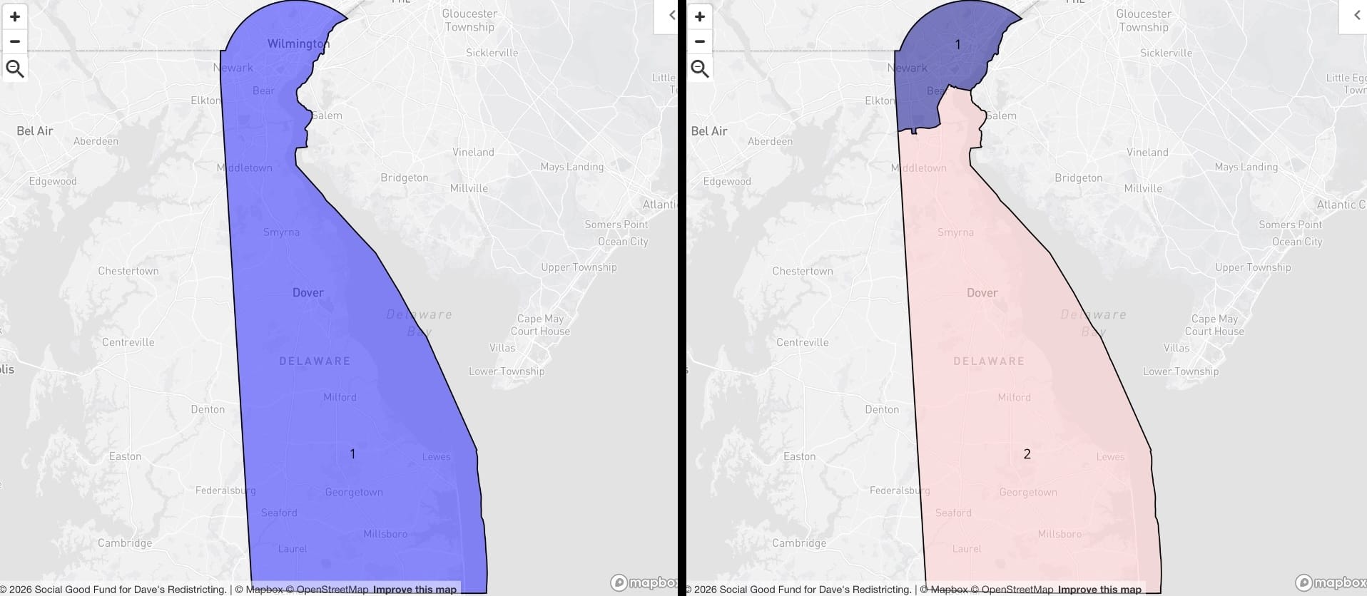
The good news is, Delaware gets a second district.
District of Columbia
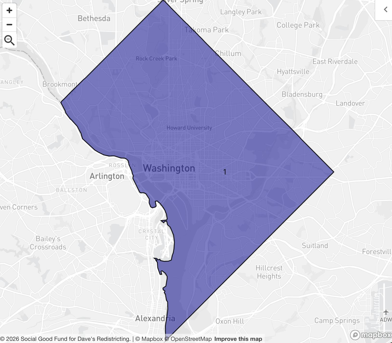
D.C. gets a district. This is not negotiable.
Florida
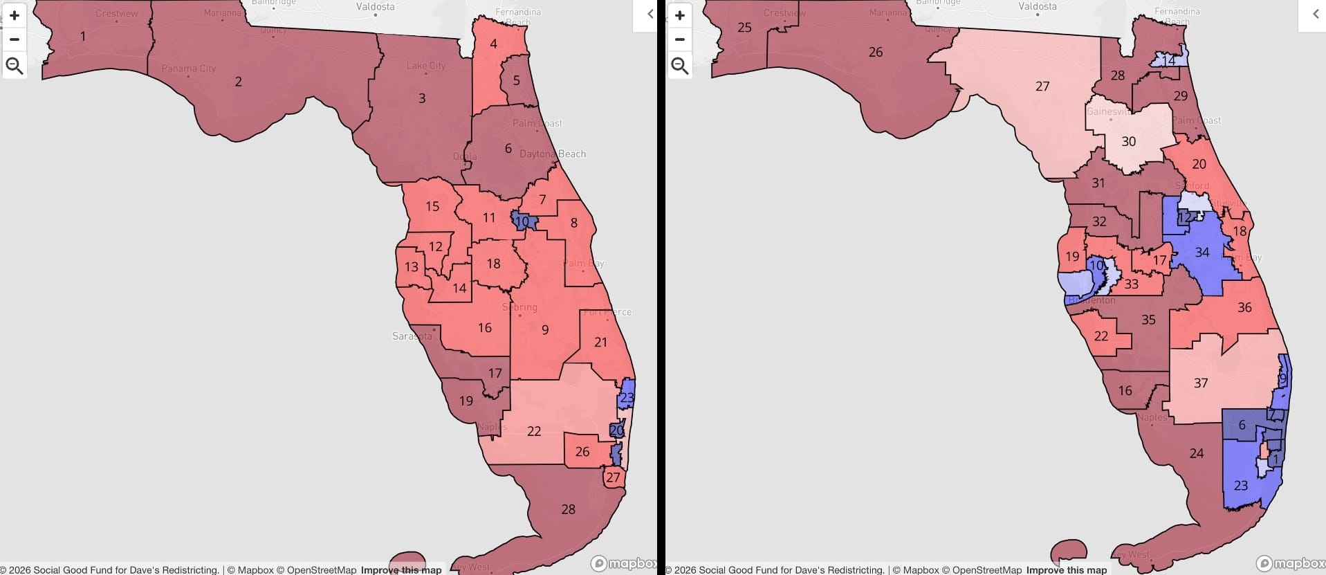
I don't know if I quite have the words to express how absolutely atrocious the adopted Florida map is. Really, you figured out a way to draw up Tampa/St. Pete so there are no majority blue districts whatsoever? You drew some creative lines through Jacksonville to turn it into two red districts? (Actually that probably didn't take that much effort.) I'm actually shocked they managed to preserve the Maxwell Frost seat in Orlando (FL-10). My proposed map draws compact districts in all of these urban strongholds, and it makes the state's House delegation much more...what's the word? Representative.
Miami is tricky, though, and it's worth looking at in a bit more detail:
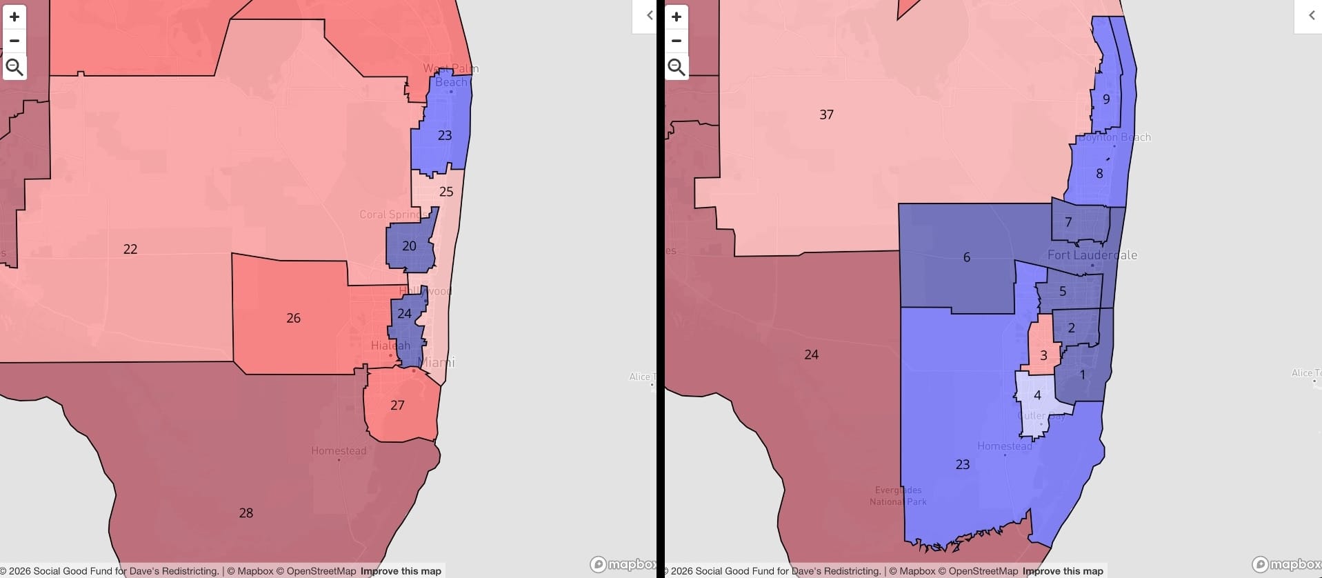
On the left, I'm not sure precisely what form of witchcraft the Florida legislature used to crowd so many blue voters into three discrete districts in Miami-Dade, Broward, and Palm Beach counties, but it sure was effective. On the right, I did my best to honor county lines and urban/suburban differences as I carved up the South Florida urban area, and it was STILL tough to find a red district anywhere (FL-03 is a weak red, FL-04 a tepid blue). I'd say there's nothing to do but tip my cap to the Florida mapmakers, but actually, I don't think I'm going to do that.
Georgia
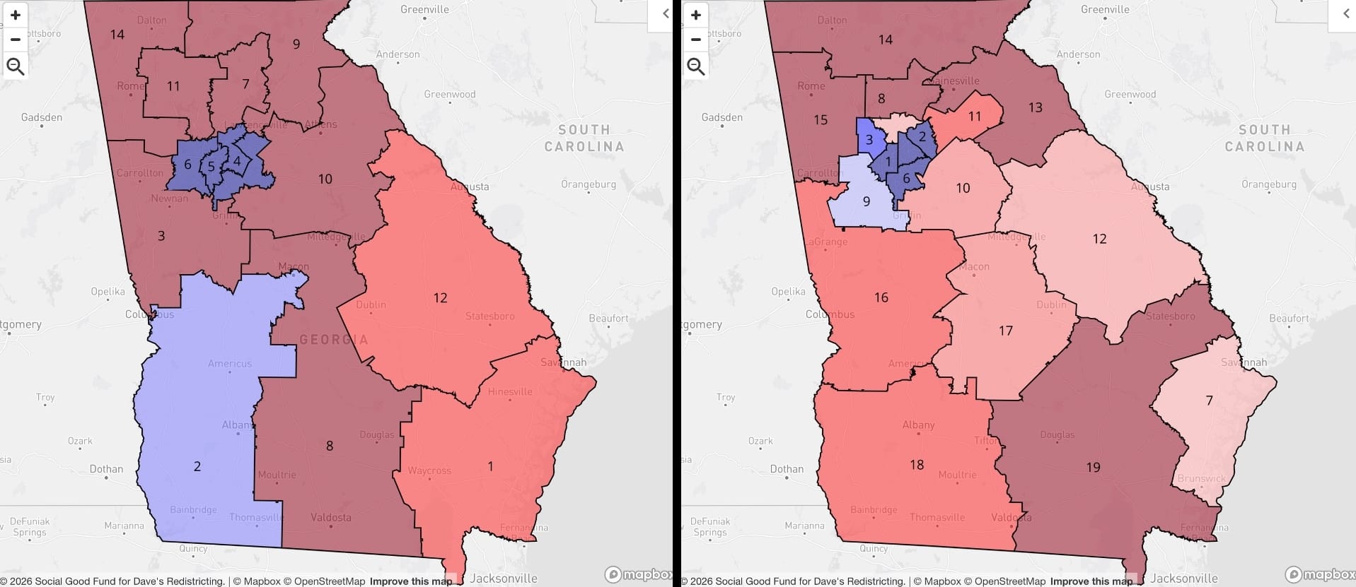
To be completely honest, I don't know that I improved on the existing map at all. The districts around Atlanta are reasonably compact as they are, and this is one where I suspect I've made a misstep by not doing any kind of Voting Rights Act analysis. Existing GA-02 does feel a bit 'mandered, grabbing chunks of Columbus and Macon to cobble together a blue-leaning district. On the plus side, I was able to make a bit more compact of a district around Savannah and the coast, and a couple central Georgia districts (GA-10, 12, and 17) start looking more competitive. Statewide, though, it's all a bit of a wash.
Hawaii
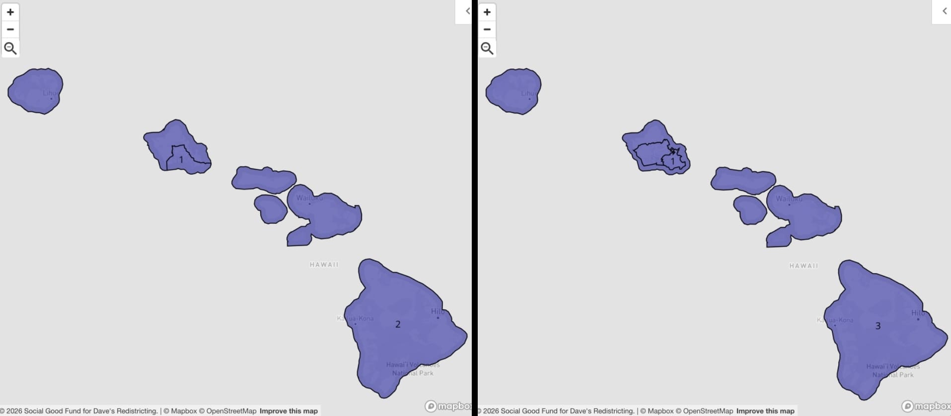
Hawaii adds a third district. There's no suspense as far as partisan lean, but the fun was in seeing how the population would break out. Now you get a highly urbanized HI-01 centered on Honolulu, a more suburban HI-02 that covers something like half of the remaining island of O'ahu, and HI-03 that get O'ahu's North Shore and all of the other islands.
Idaho
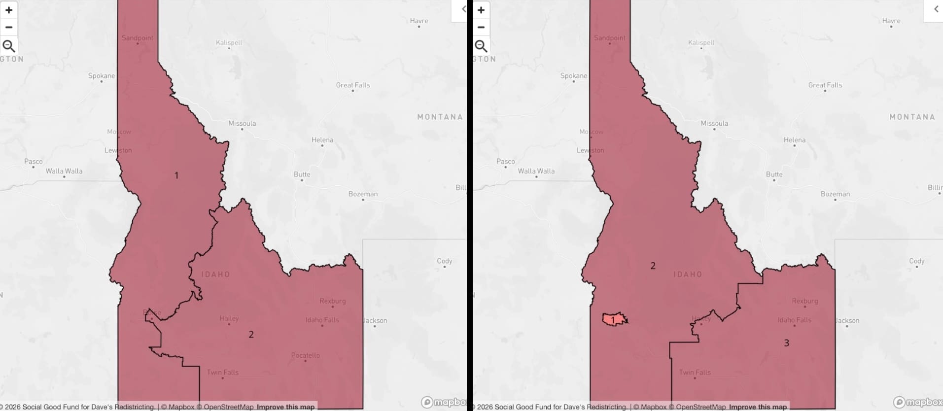
It's hard for me to overstate how excited I was to draw a new district in Idaho, custom-built for the roughly half-million population Boise metro area. It's also hard for me to overstate how underwhelming the results were.
Illinois
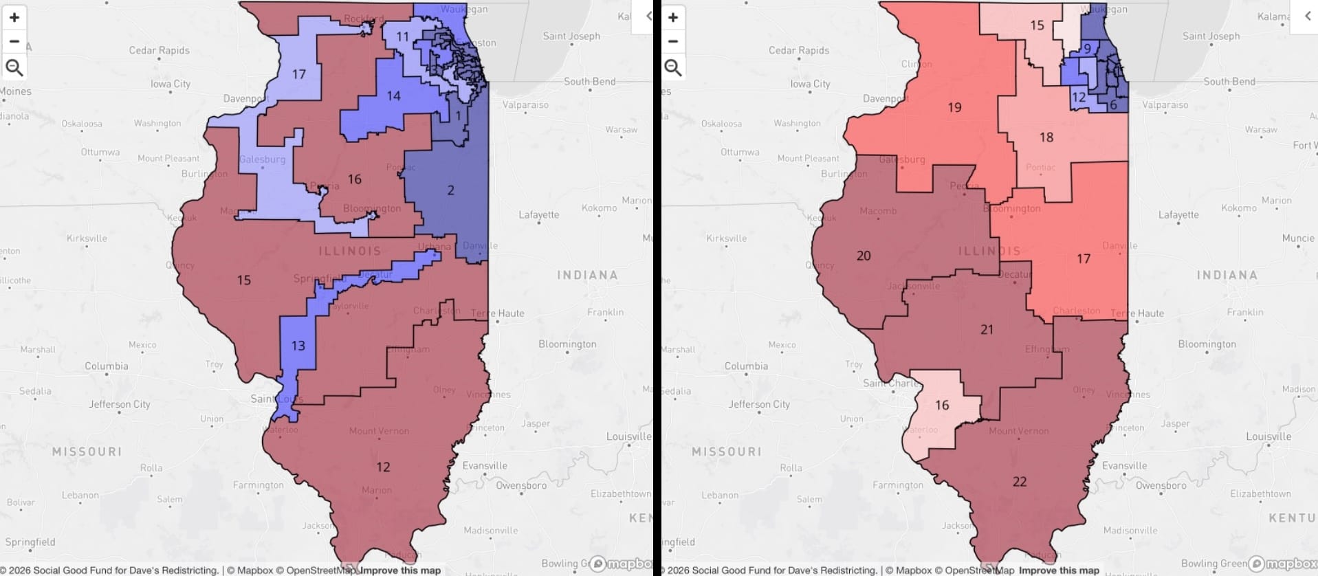
This adopted map is probably the most offensive of all the blue state gerrymanders. Existing IL-13 might be the most absurd congressional district in the country, cobbling together East Saint Louis, Springfield, Decatur, and Champaign-Urbana into a D stronghold where really, at most, there should be maybe one competitive district. (My IL-16, right, ends up pretty pale pink.) Chicago is a whole other story.
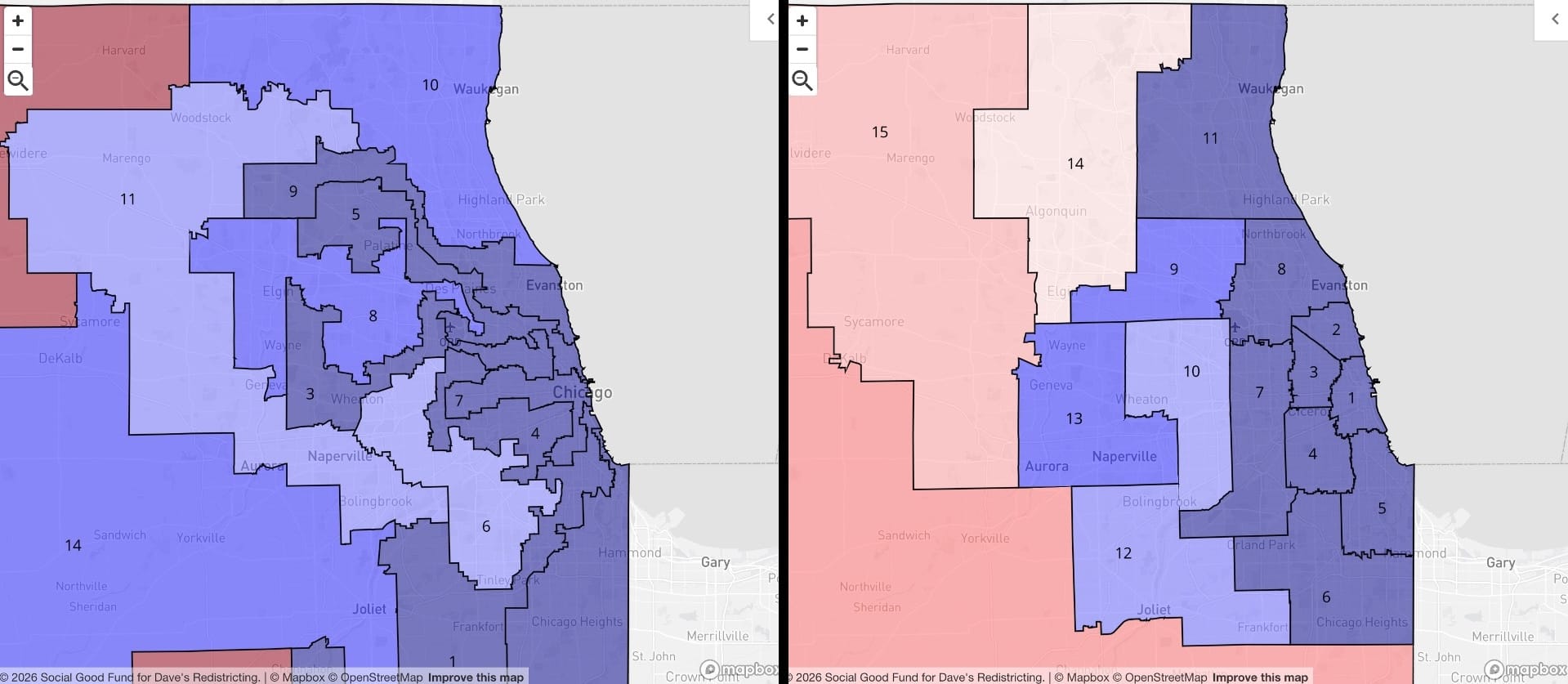
I don't want to get in too much trouble with the Chicagoland Democratic machine, but...did Jackson Pollock draw the adopted map? My proposed Illinois map almost certainly does worse at maximizing likely blue districts statewide, but it better aligns neighborhoods with political representation, and...it's just so, so much more aesthetically pleasing. (Guess I'm a Mondrian guy.)
Indiana
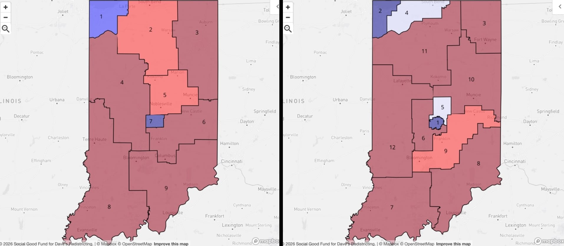
I don't have much of a problem with the existing map. With nine districts, you're really just going to get two urban ones, Indianapolis and Chicagoland: Indiana Edition. My proposed 12 district map doesn't change things much as far as statewide partisan lean, but you do get more granularity in both blue strongholds, which makes primaries a little more interesting. The new, proposed IN-05 in the northern part of the Indy metro area is 48.5% D - 48.5% R — the ultimate swing district.
Iowa
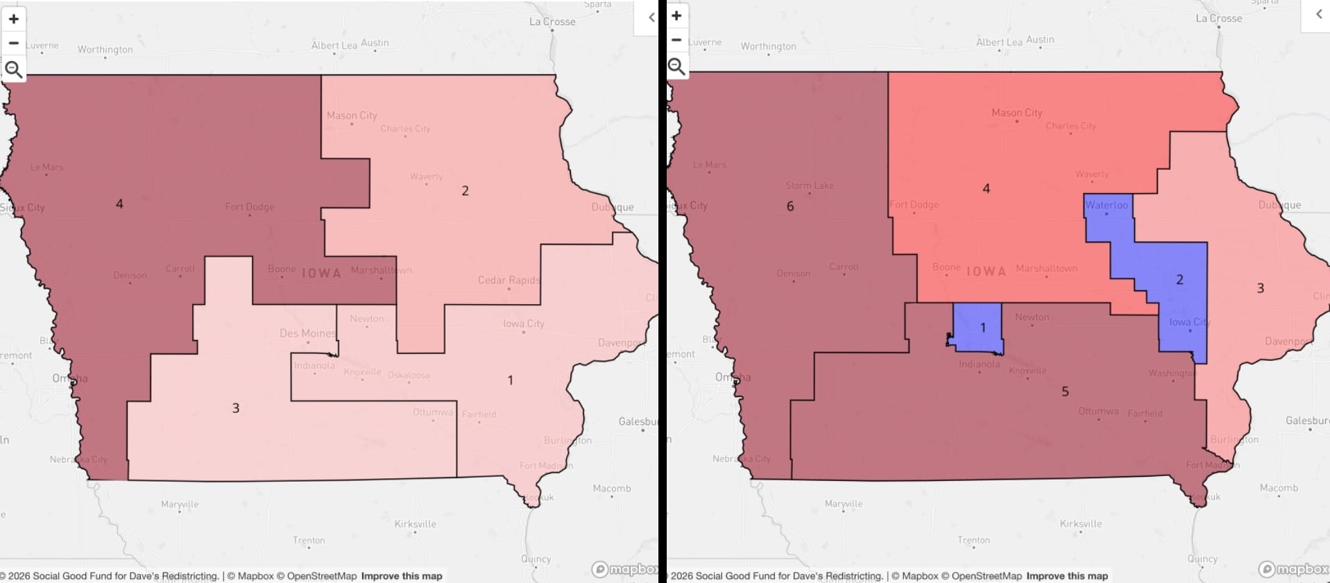
Iowa's existing map kind of looks like it was drawn to manufacture competitive districts, but I think the reality is, with just four districts of around 800,000, you can't really build one of them around Des Moines. The state gets a whopping TWO additional districts under the 575-representative plan, so now we're in business. Polk County (Des Moines) gets IA-01 basically all to itself, and then Linn (Cedar Rapids) and Johnson (Iowa City) occupy most of IA-02. The Hawkeye State: sneaky urban density and maybe more purple than you're expecting.
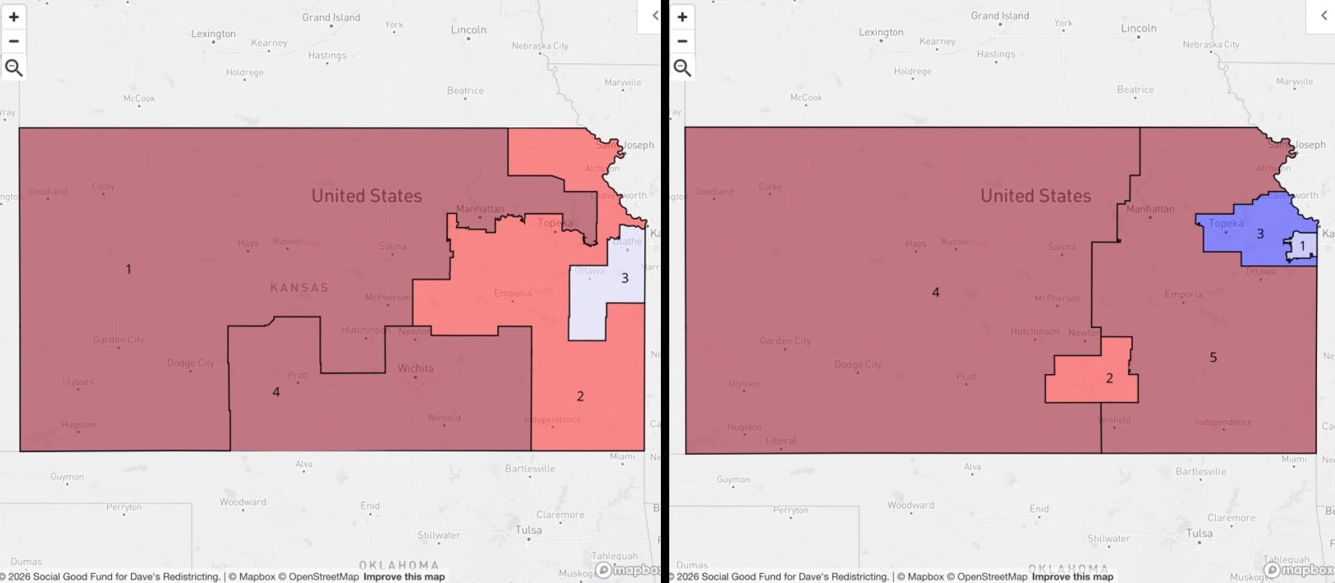
Kansas
The adopted map doesn't seem that offensive until you try drawing your own. Granted, the 575-rep scenario gives you an extra district to work with, but it's pretty trivial to draw a dense suburban district around Kansas City, Kansas (new KS-01), a mildly competitive KS-02 around Wichita, and then...you just draw a normal polygon around Topeka, Lawrence, and the remaining Kansas City suburbs and you get a full-blown blue KS-03? This is all hiding in plain sight in the existing Kansas map:
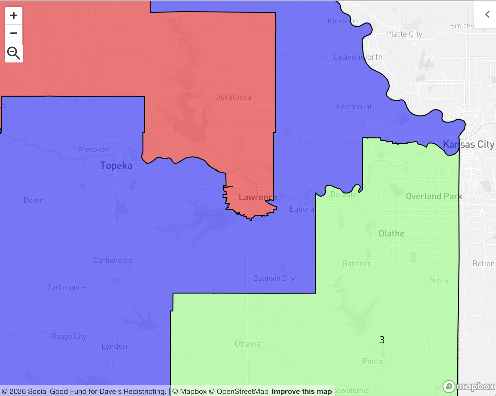
Now it all makes sense. The KC suburbs are divided up creatively, Topeka is mildly butchered, and college town Lawrence is cordoned off into western Kansas. Really a master class in how to make blue voters disappear.
Kentucky
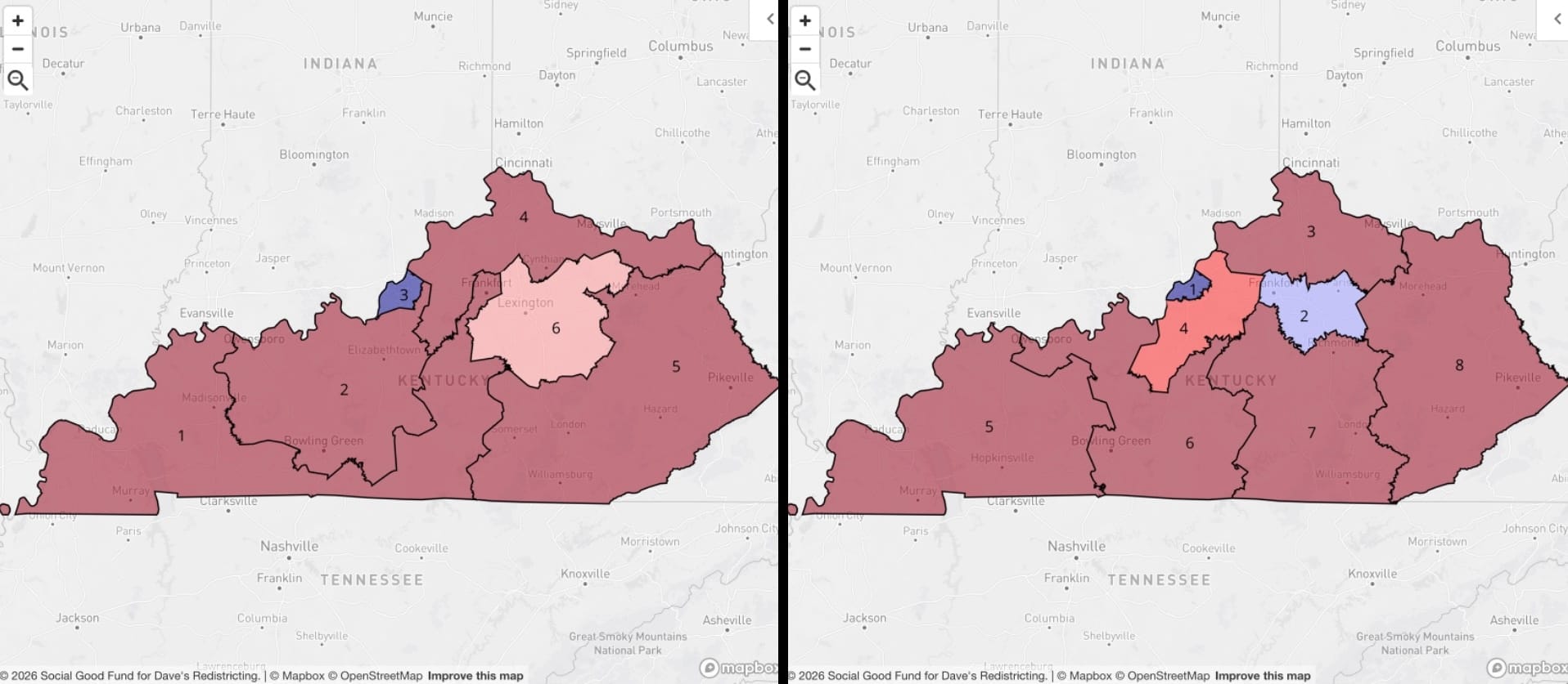
The existing Kentucky map isn't really so objectionable. It basically does with six districts the same thing I try to do with eight: center one district each on Louisville and Lexington, and carve up the rest of the state. Look closer at existing KY-01, though: the shape is extremely suspicious, starting in western Kentucky, snaking its way along the southern border, and then reaching up to snatch Frankfort, the state capital. The thing I like best about my proposed map is it makes a compact KY-02 around Lexington, and ropes in nearby Frankfort, too. The new KY-04 picks up some of Louisville's urban area, too, so you get the type of district that can be competitive in years like...2026.
Louisiana
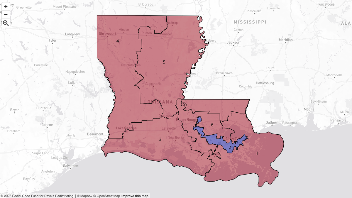
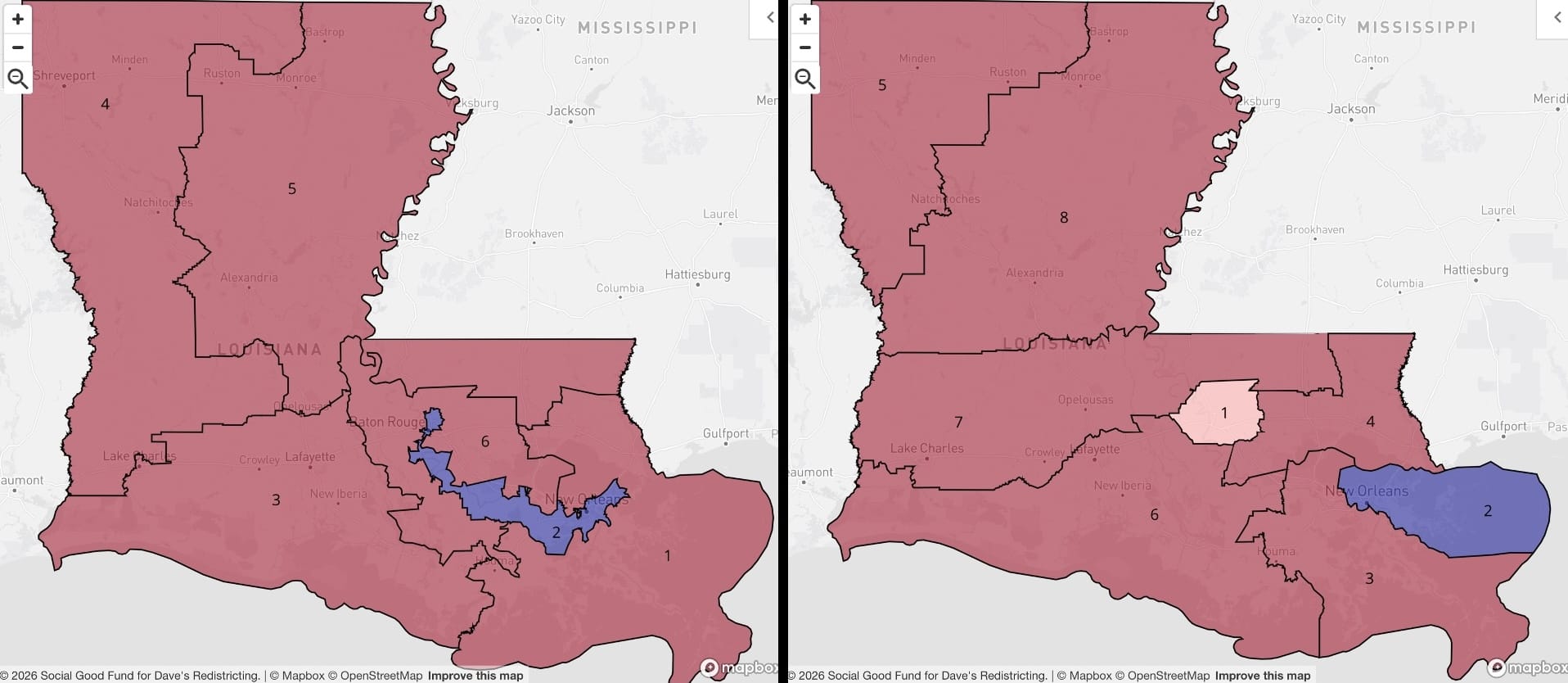
Louisiana's congressional map, adopted in May of this year and upheld by the U.S. Supreme Court, dismantles a previous district built around Baton Rouge, and instead cobbles together a district, LA-02, that concentrates likely Democratic voters into one highly irregular polygon. (The story of how Louisiana arrived at this map is at the heart of what's happened with the Voting Rights Act this year — NPR has a good summary.) My method of drawing districts that keep cities and urban counties whole as much as practicable restores Baton Rouge as LA-01.
Maine
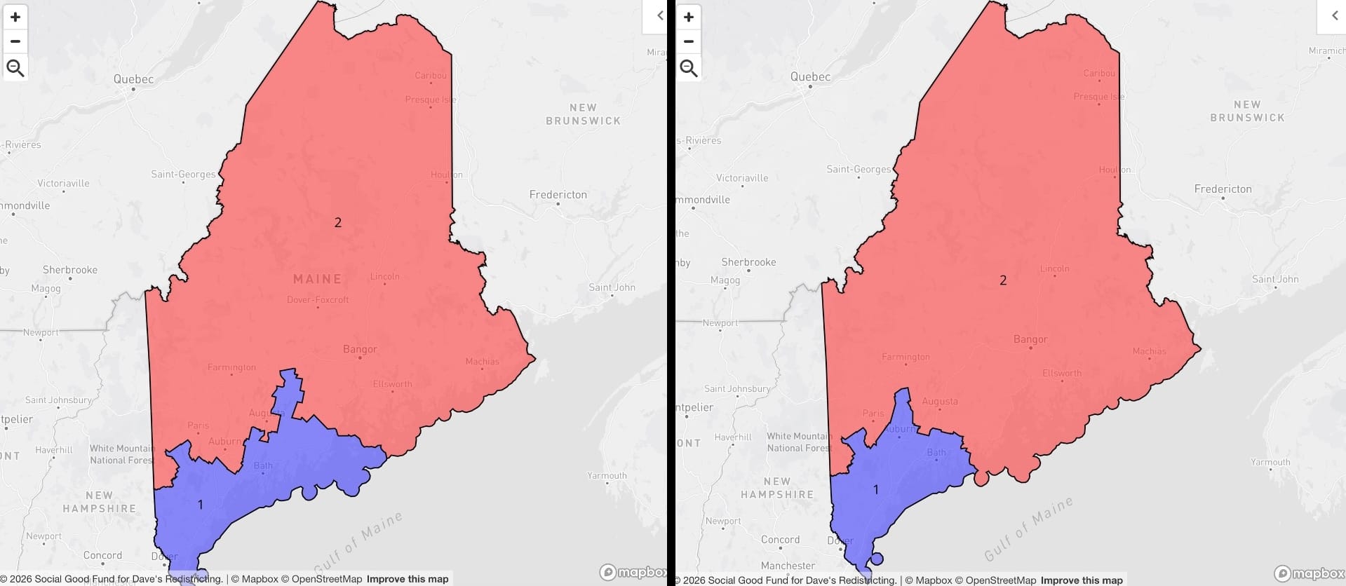
Behold: the winner of the "yup, that's about how I woulda drawn that" award. Maine stays at two reps under the 575-seat House plan, and the existing and proposed maps couldn't be much more similar. The Portland metro area gets a seat, and the rest of the state gets a seat. What else could possibly make sense?
Maryland
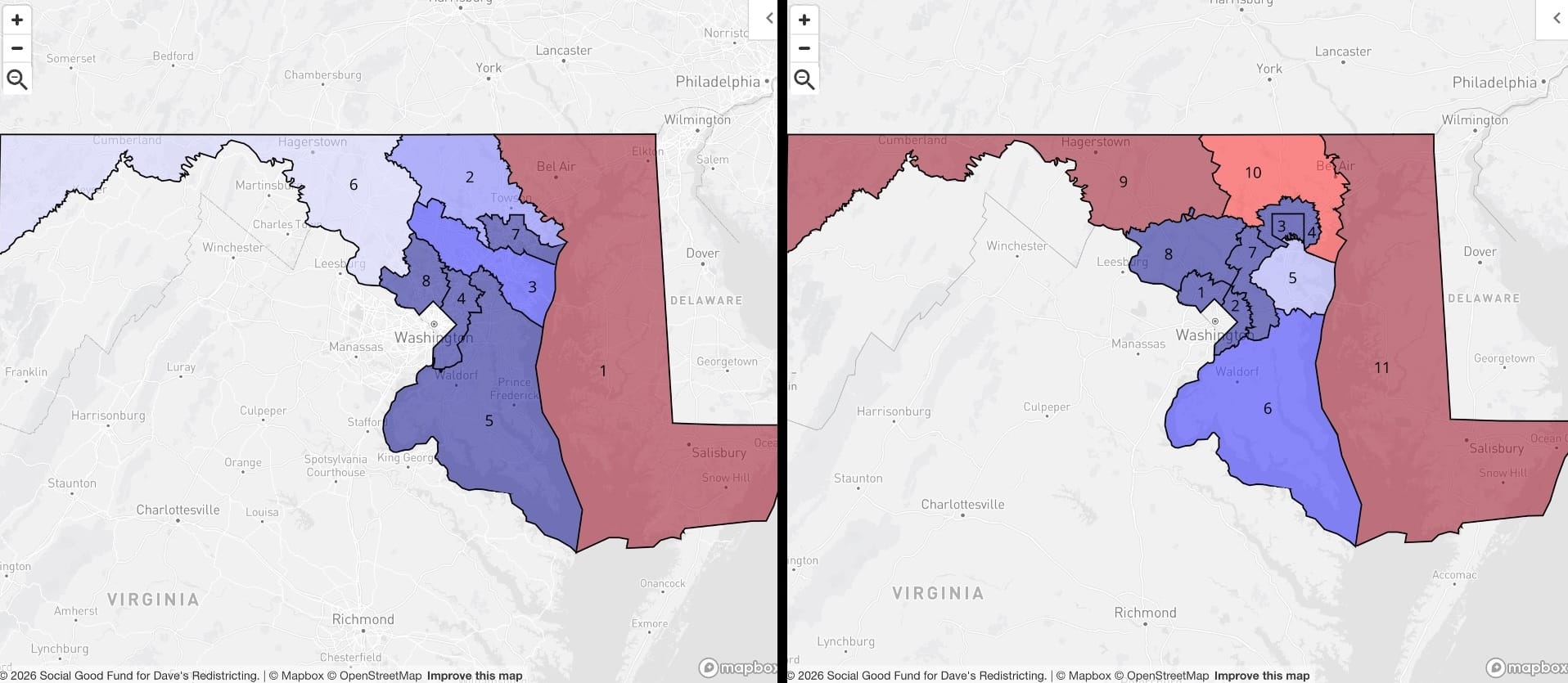
If you're Team Blue, the existing Maryland congressional map is lovely: there's not a lot you can do with the eastern part of the state, but there's enough D vote in the Baltimore-DC influence area to infect everything else in the state if you draw the lines right. (I mean "infect" in the kindest way possible.) I think adding three districts complicates this math a bit for Democrats. I didn't investigate it too deeply, but I think it would be tough to gerrymander the panhandle into a blue-leaning district with an 11-seat map. Anyway, I really like the way the new district sizes let you more clearly assign seats to Baltimore proper and the different suburban contexts surrounding both Baltimore and Washington.
Massachusetts
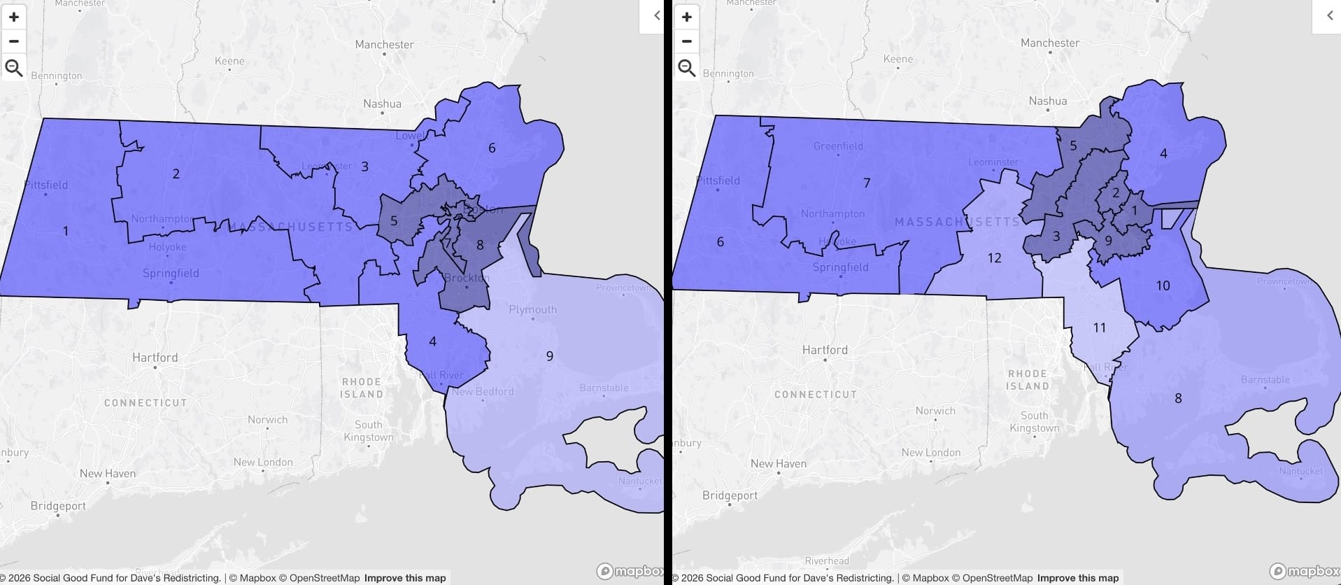
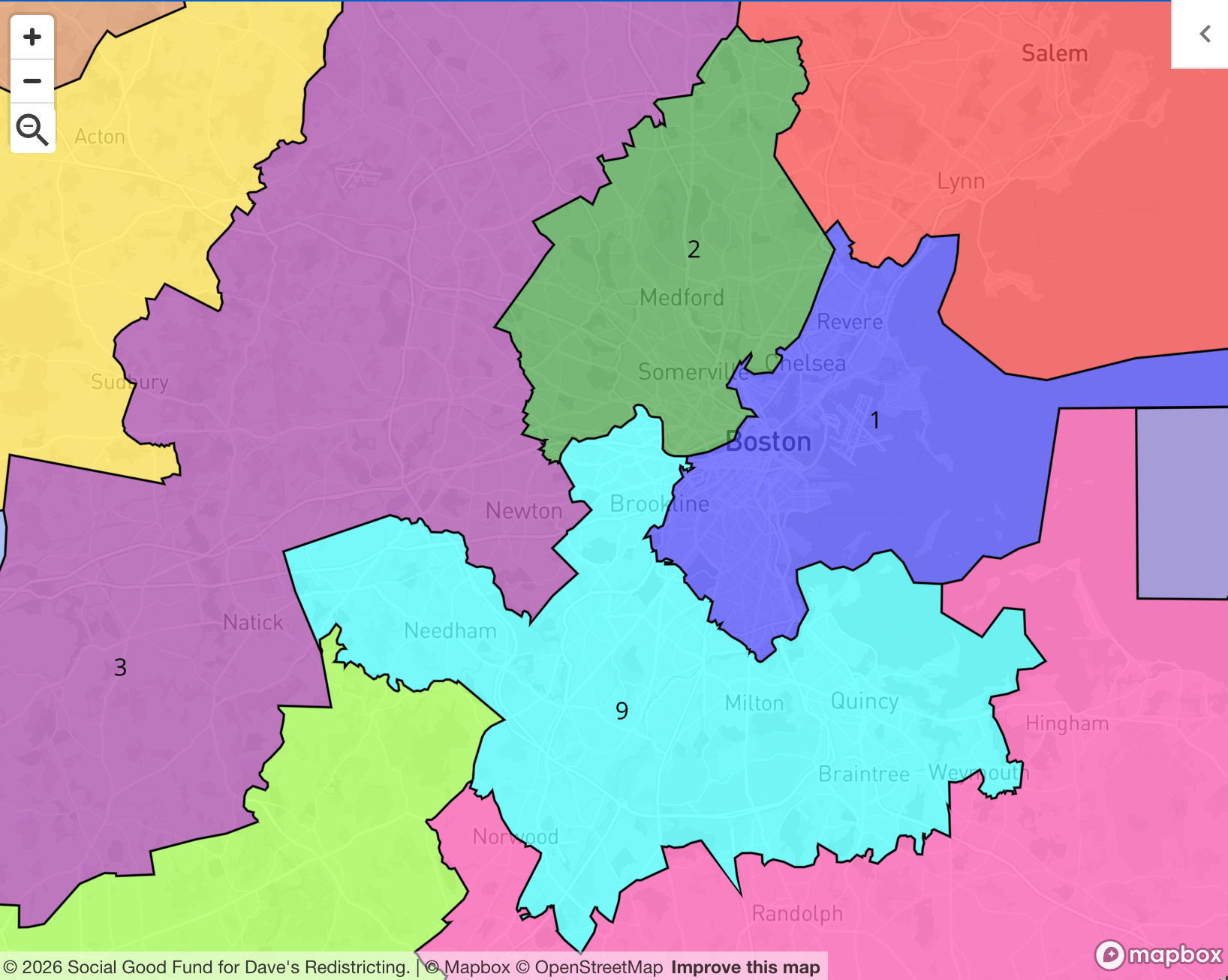
I think the lesson from both the existing and proposed maps is that it would be extremely tough to draw a Republican-leaning district anywhere in Massachusetts. I'm not even sure why the Boston area on the adopted map has such janky looking districts; what could you possibly hope to accomplish with any kind of gerrymandering? I prefer the way the proposed map splits Greater Boston into chunks that are likely to have a more unified political identity. Here's a closer look:
Michigan
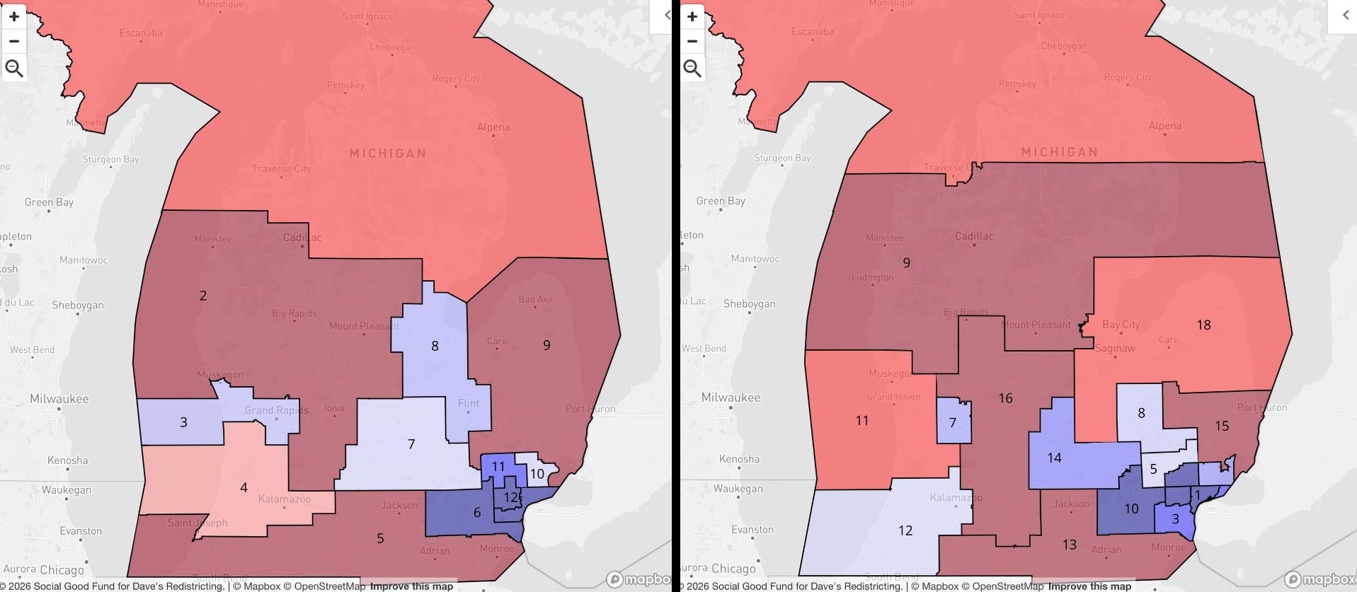
A bit of trivia: in the apportionment process I used, Michigan got the 575th district; placing the final district in any other state would've done more harm to overall proportionality. (Read up on the Huntington-Hill method if you want to know more.) Otherwise? No real complaints about the existing map. The five additional districts in the proposed map allow for more granularity in southeast Michigan, and for Grand Rapids to get a nice, compact MI-07. Apologies for chopping off the upper peninsula in the graphic. It gets its own district either way.
Minnesota
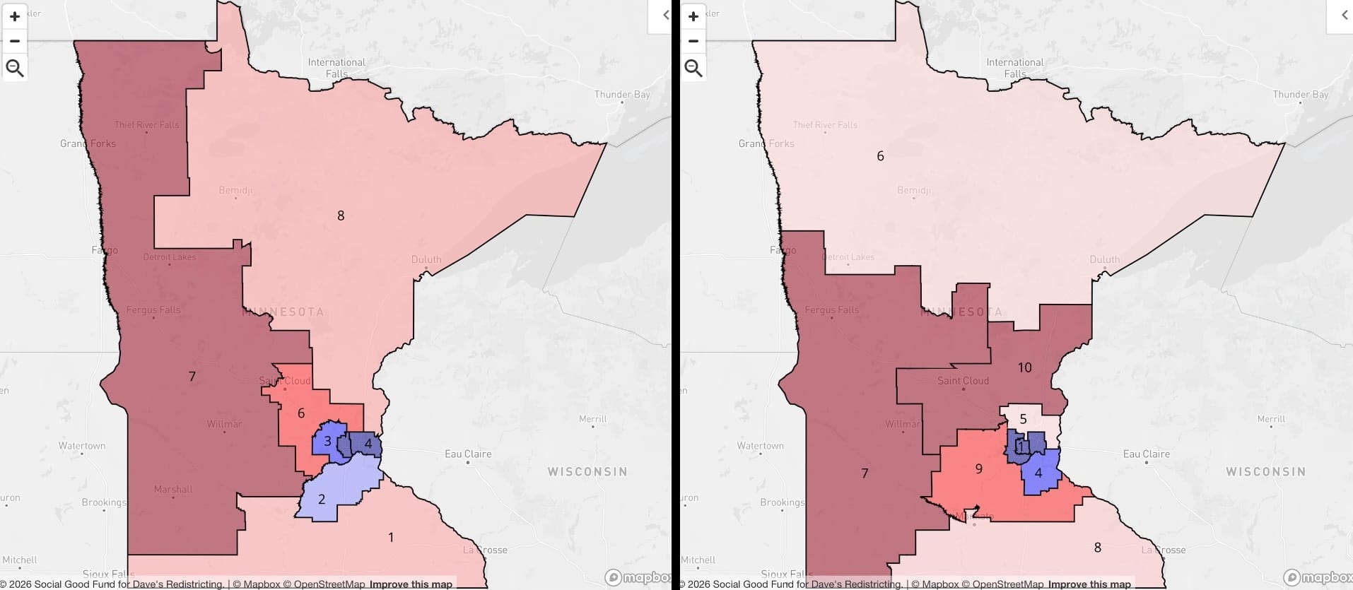
Similar to Michigan, the existing eight-district map of Minnesota is, roughly, the way I think congressional maps should be drawn. Tight districts around cities, sprawling districts everywhere else. With the additional two seats, I'm able to get five in the Twin Cities metro area, and then I opted to draw MN-06 to cover as much of northern Minnesota as possible. Interesting that it ends up being paler than the MN-08 on the existing map.
Mississippi
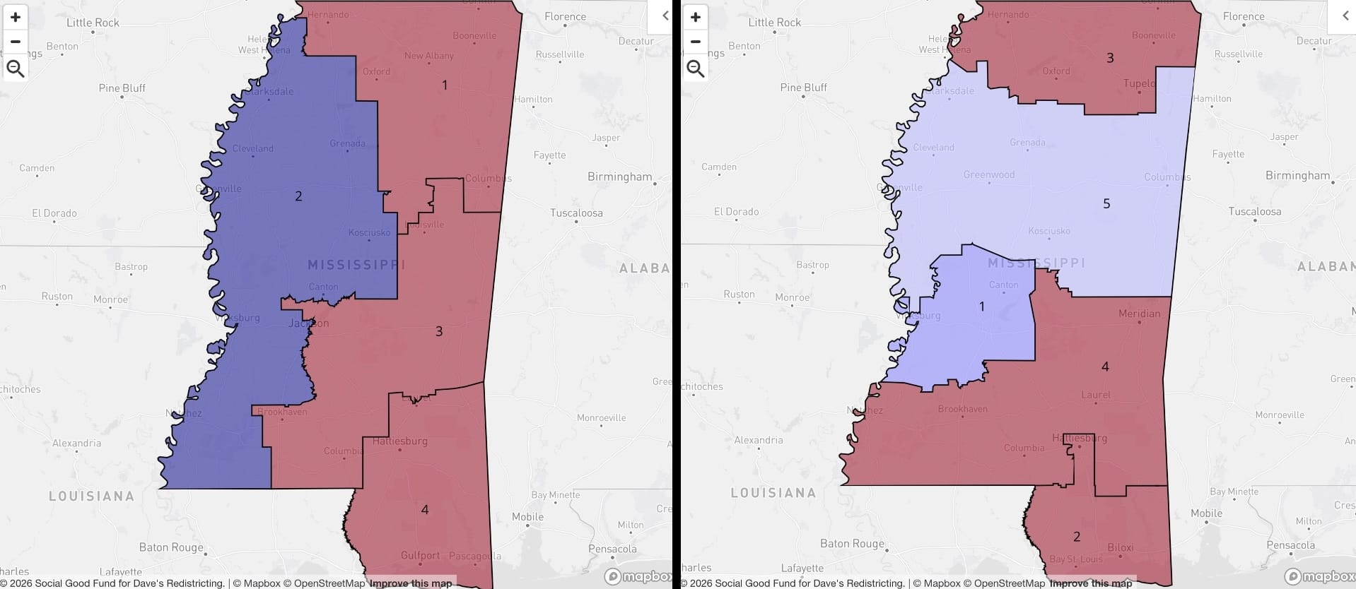
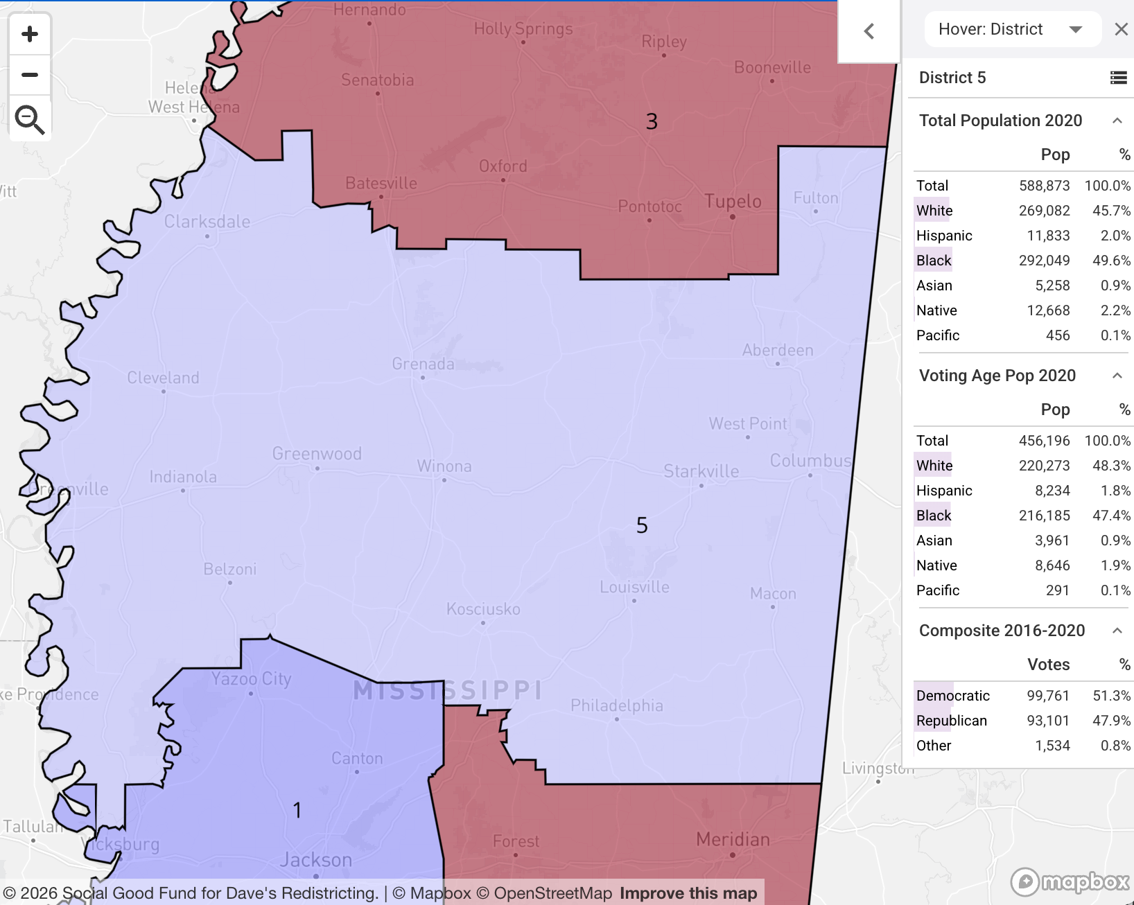
I haven't checked out the math, but it surprises me that whoever's in charge of drawing maps in Mississippi hasn't looked at what happened in Louisiana and figured out how to manufacture four fully R districts. Anyway, Mississippi gets a fifth under the Wyoming Rule. Jackson gets MS-01, Biloxi gets MS-02, and rural MS-05 leans a bit blue. It's outside the scope of this piece, but there's a lot to say about the intertwined geologic, agricultural, and human rights history of this particular band of the continental U.S. I encourage you to look into it, though — it's fascinating and awful — and in the meantime I'll leave the MS-5 demographic break down right here:
Missouri
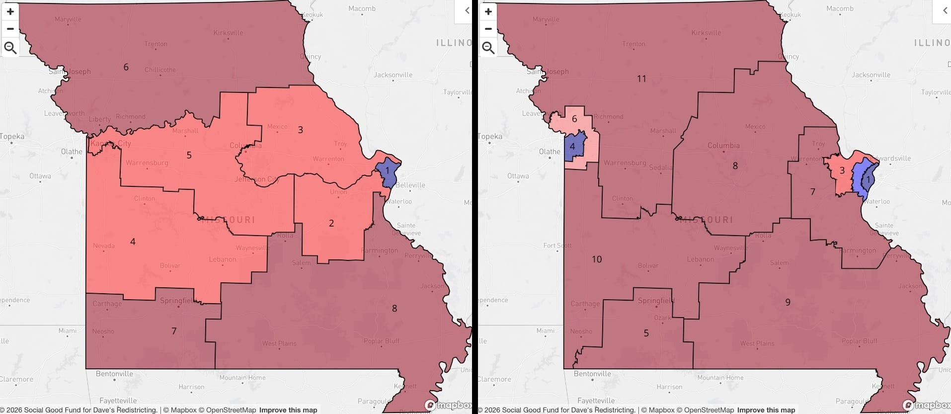
The existing Missouri congressional map is definitely in the running for most offensive. It concedes a single blue district, MO-01, in St. Louis, and...that's it. It dilutes the rest of that metro area's vote into MO-02 and -03, and then...what, you really couldn't keep Kansas City intact? KC gets all of its representation scattered to MO-04, 05, and 06. It's ugly, too:
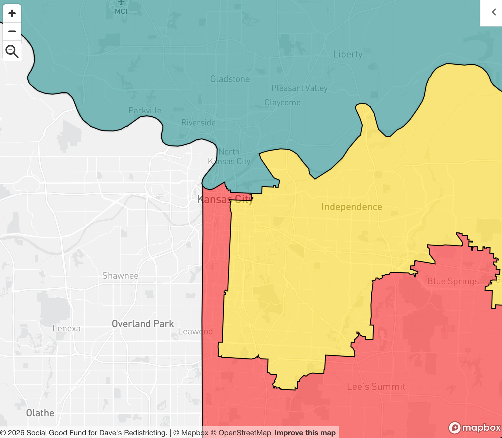
My proposed Missouri map rights all of these injustices. Free Topeka. Free Lawrence. And, for the love of god, free Kansas City.
Montana
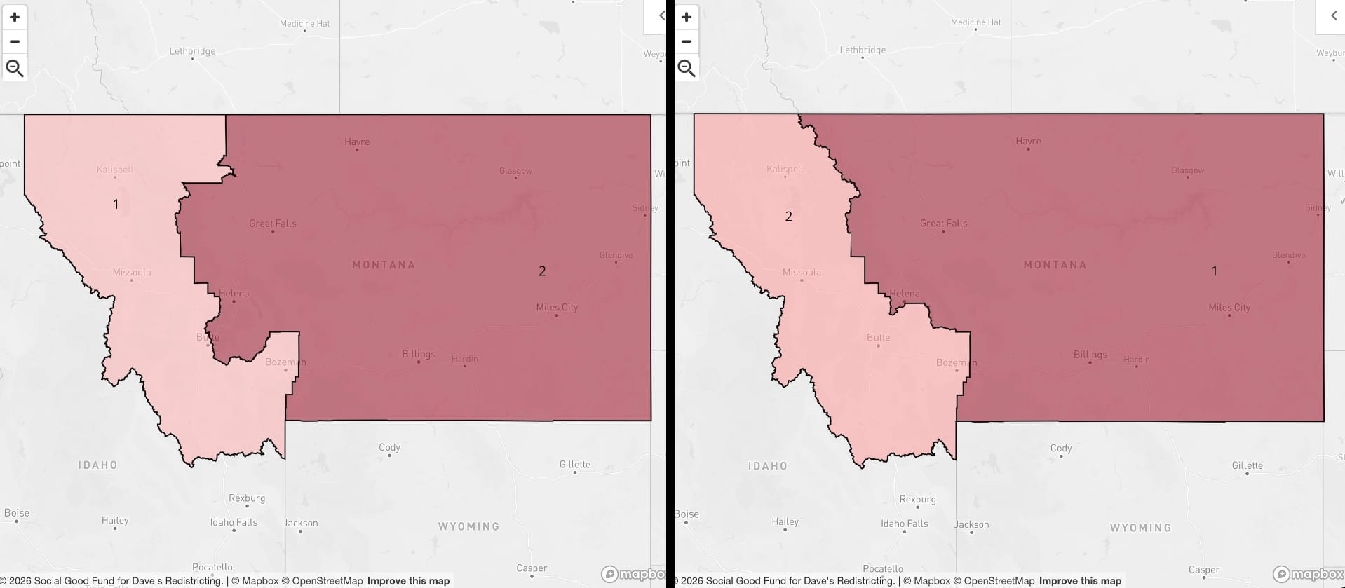
Kind of a cool state! I probably shouldn't even mess with it.
Nebraska
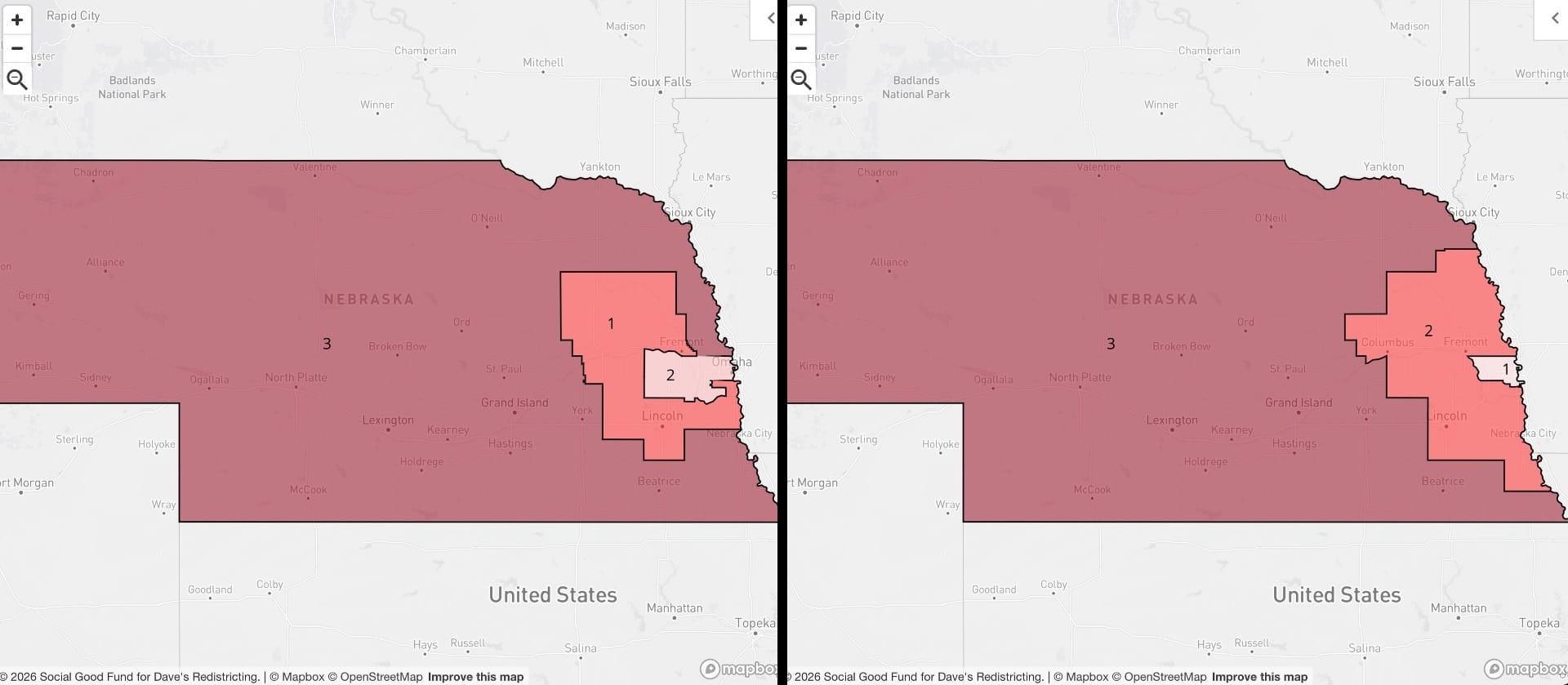
Cornhuskers stay at three representatives, and the maps are...similar, but where the proposed tries to keep the densest parts of the Omaha metro area together as much as possible, the existing map slices it and scatters it a bit. Not an enormous difference, but the NE-01 in the proposed is basically a 50/50 district, while the NE-02 in the existing has a measurable R lean.
Nevada
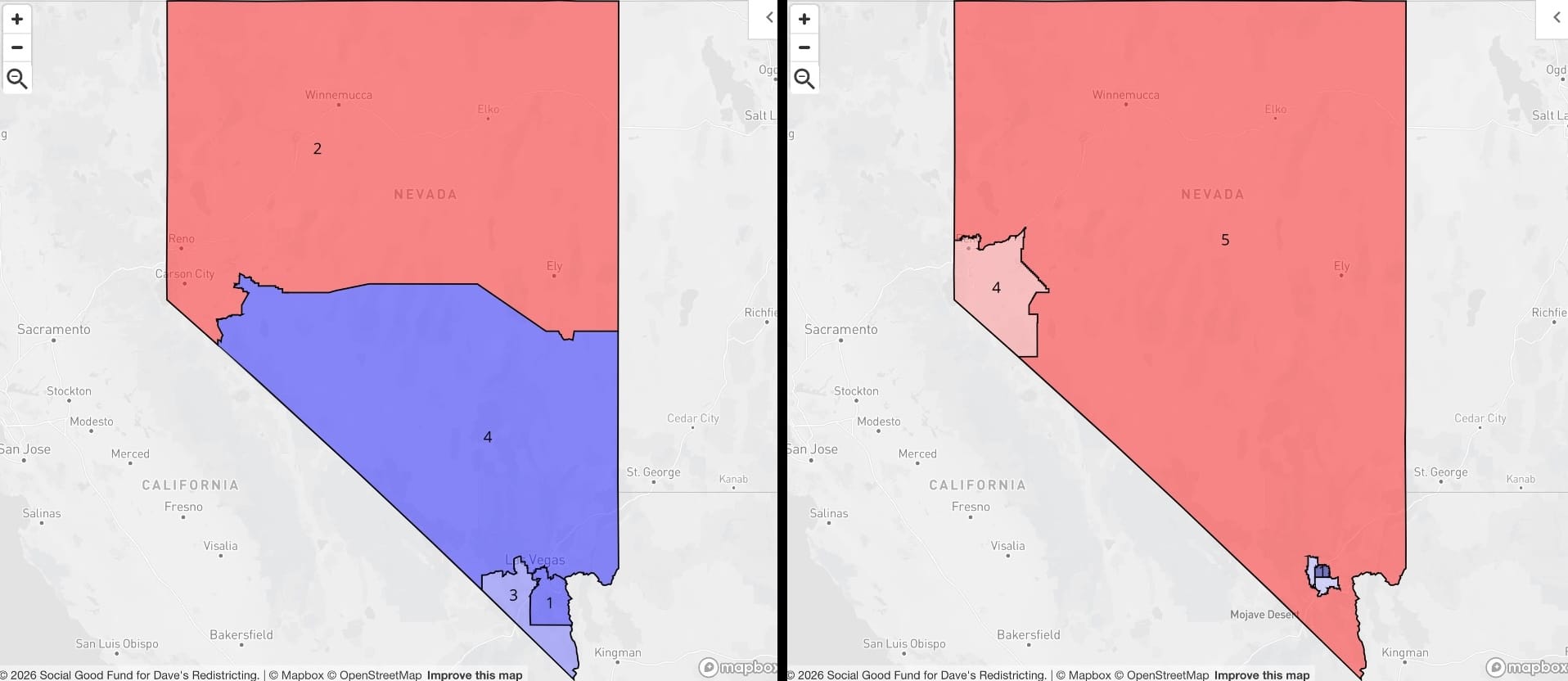
How about this. I added a district to Nevada, but somehow managed to reduce the number of likely Democratic representatives. I'm out here trying to do the right thing! Honest! Reno is a metro area around half a million. Under the existing map it gets diluted into sparsely (huge understatement) populated northern Nevada, but under my 575-rep scheme Reno gets its own NV-04. I think this is good and just!
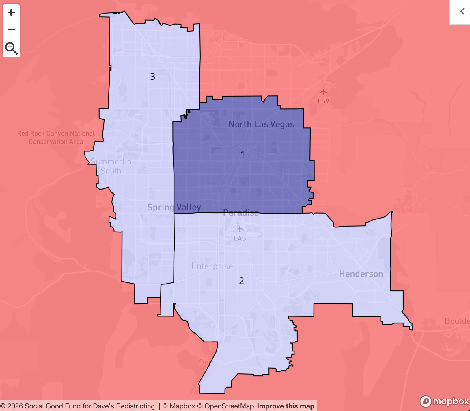
Then, the adopted map takes all of the blue-vote gravity of the Las Vegas Valley and scatters it to other, larger districts. (I get why you do this, but I just have different objectives.) My proposed map? Three tightly defined districts in the valley, representing, I think, distinct geographic constituencies. Decide for yourself:
New Hampshire
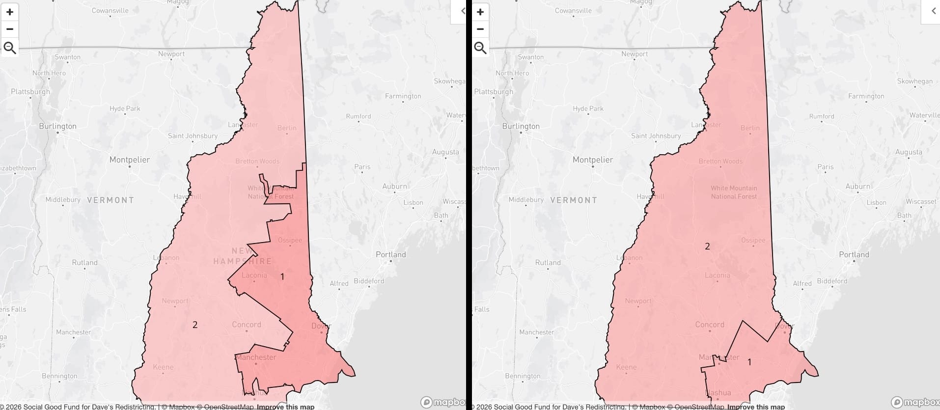
I need the New England understanders to step in and help me out on this one. This is one of the most important states in the U.S., electorally, especially pound-for-pound. Presidential campaigns crash on the shores of its early primary and evaporate into thin air! All over just a tiny handful of delegates! So, New Hampshire is theoretically a swing state, but it's...extremely weird. The two-district population distribution feels similar to Maine, where you get a clear blue-leaning urban-centered district and a red-leaning rural one. But in New Hampshire you get a small urban district of Boston metro area tax evaders, I guess? I challenge someone to go in and draw a blue district in New Hampshire — I just wanna know what it looks like (if it even exists).
New Jersey
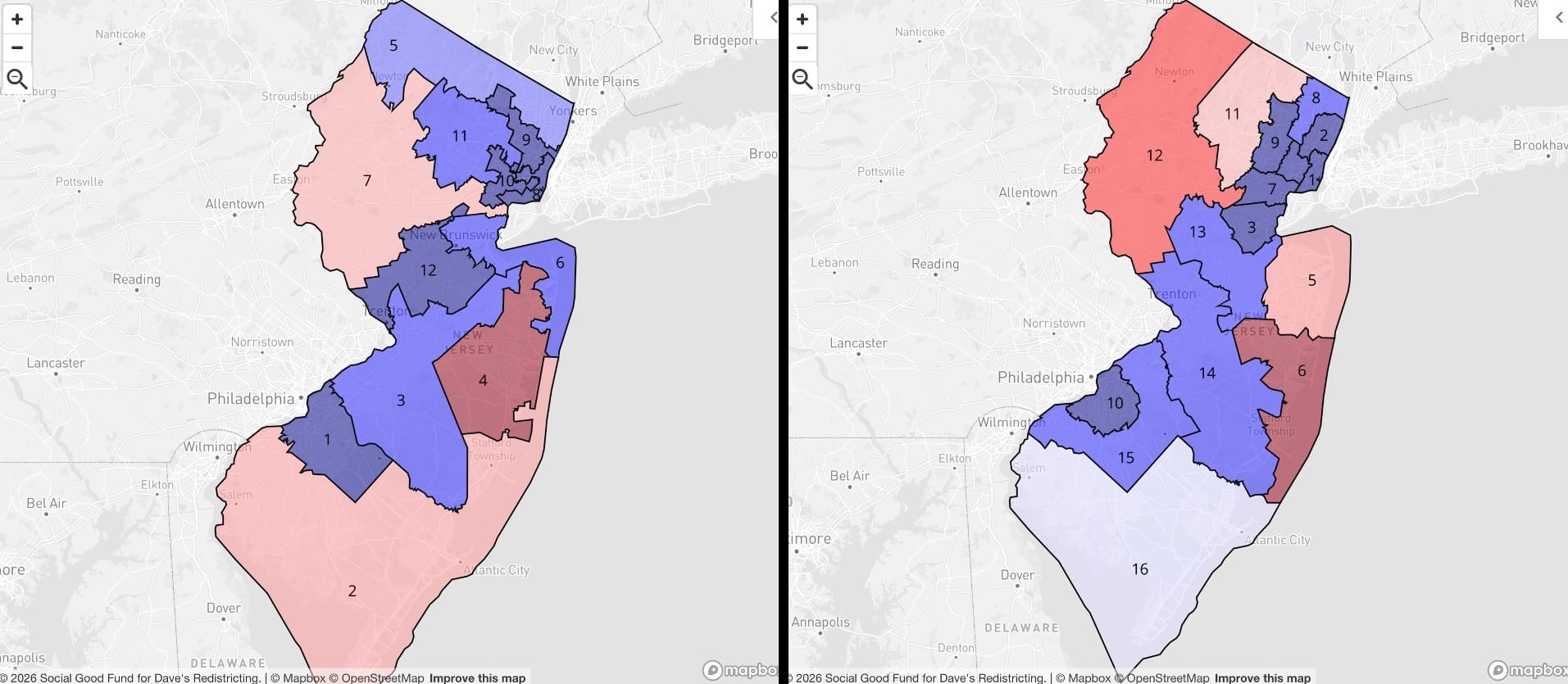
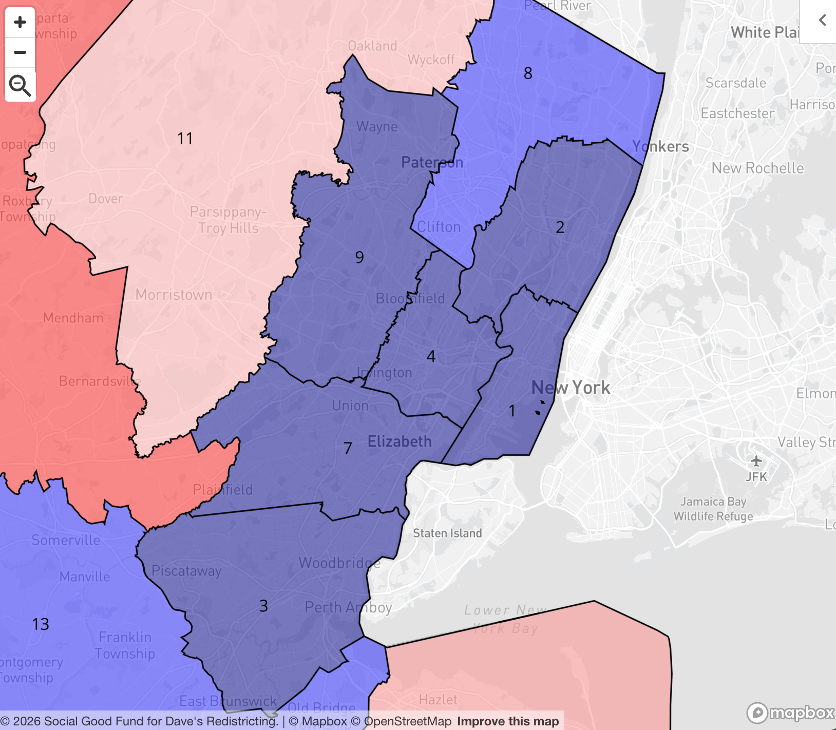
Statewide, New Jersey only has a partisan lean of about 56% Democratic, but this is a perfect example of the concept I discussed above: that district-level proportionality is intuitively correct, but near impossible (and, I would argue, unjust) in practice. The adopted congressional map is around 75% likely D representation; the proposed map is similar but more granular, with better-defined districts built around county lines. I hesitate to offer a zoomed-in map since New Jersey is so geographically small in the first place...but I think it's necessary.
New Mexico
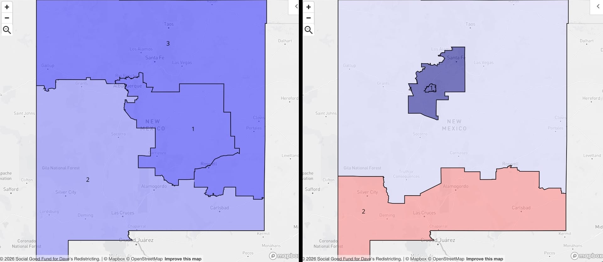
OK, I'm afraid I did the Land of Enchantment Democratic party dirty with this one. The adopted New Mexico map spreads just enough of Albuquerque metro's blue voters into the south to get all three districts leaning blue. My proposed map, though, sticks to its principles to a fault, and maybe even an actual fault. Apparently, drawing districts like my NM-01 that are "islands" within other districts, like my NM-03, is frowned upon. I even compound the fault by encircling that one with the much more rural NM-04. I think some states may actually even have statute that prohibits this kind of donut action! If so, let's add rectifying that to the action item list, because it seems kind of arbitrary and maybe even anti-city.
New York
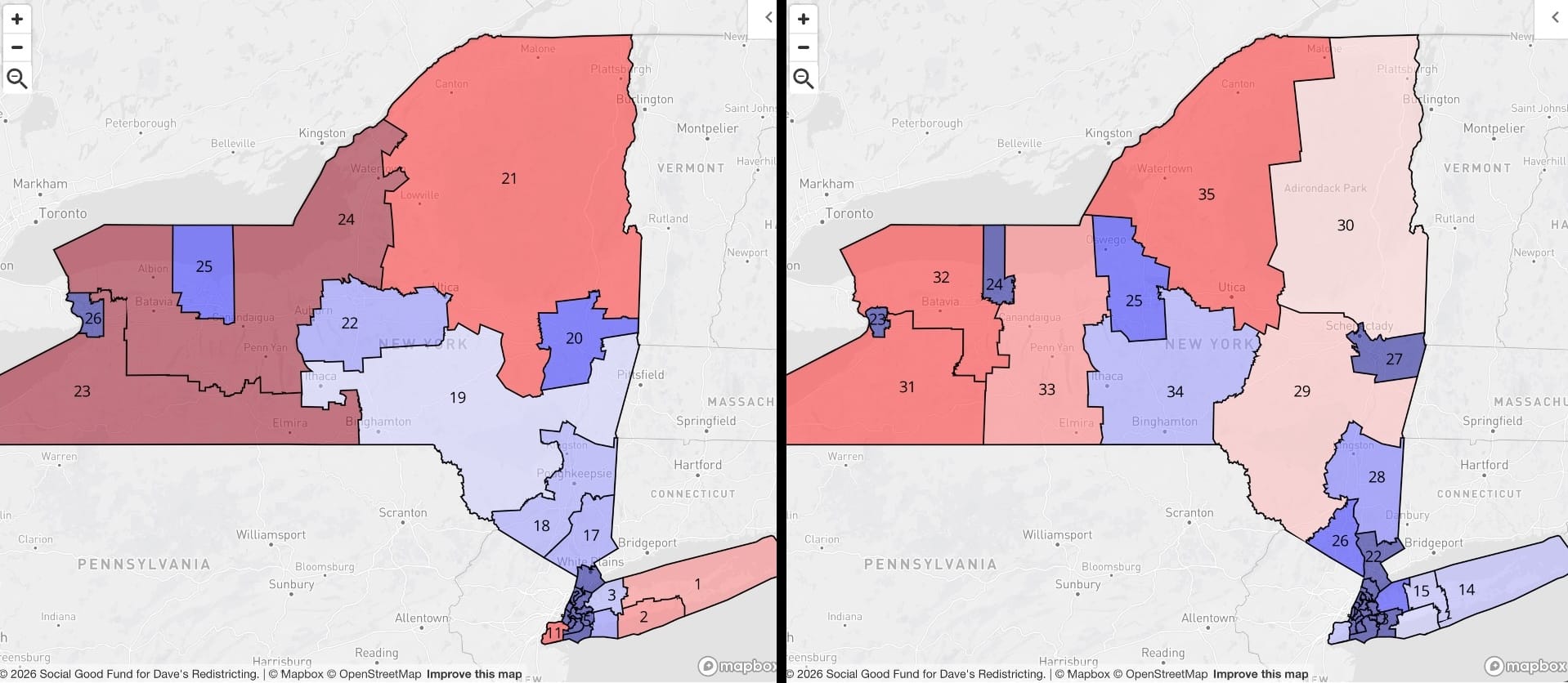
On first glance, the two maps don't seem all that different, other than the number and size of the districts. West to east, in both maps, Buffalo, Rochester, Syracuse, and Albany all anchor their own districts, and there's a ton of blue in and around New York City. But I have questions. I drew the most geographically sensible districts I possibly could working my way in from the east tip of Long Island and from Staten Island, and I still can't figure out how they managed to find a single red district, let alone three. I mean, I know Staten Island and the Hamptons skew much less liberal than the rest of downstate New York, but...I still have questions.
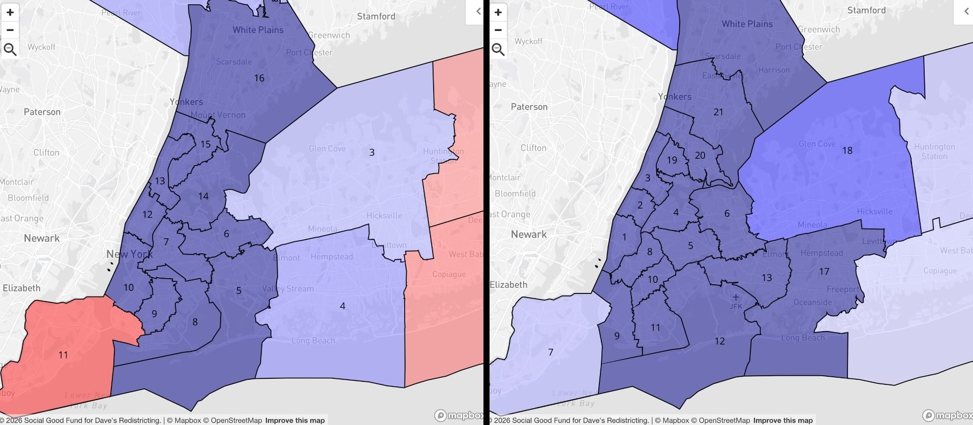
I'd have to analyze it further, but I'm inclined to say the existing New York map is gerrymandered to bolster Republican representation. The state has a 63% Democratic lean, so if you've been following along (and you agree with my analysis), the partisan breakdown of House seats should be even more extreme. Well, under the existing map Democrats get an expected 72% of seats, and under the proposed: 81%. I like my proposed map better, but really just in terms of representing distinct cities, boroughs, and even neighborhoods more fairly; let the partisan chips fall where they may.
North Carolina
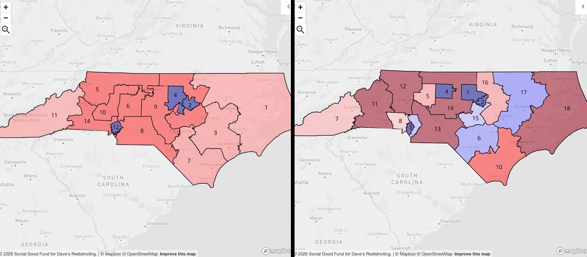
Here's another one for the redistricting hall of shame. How do you get only three (OK, 4.18) blue districts out of a state as purple as North Carolina? It didn't actually seem that egregious to me until I made my own North Carolina map and realized how many Democratic voters there are in Charlotte, the Research Triangle, and even the Piedmont Triad. Wake County (Raleigh) is actually the most populous in the state, so you start there with NC-01 and -02, pulling in adjacent Durham; Mecklenburg County (Charlotte) gets NC-03; Guilford County (Greensboro) gets NC-04; and then you get all kinds of competitive and even blue-leaning districts in suburban and even rural areas. (I'll let you research the geology, soil characteristics, human rights history, and demographics for yourself.)
North Dakota
One seat today, one seat forever.
Ohio
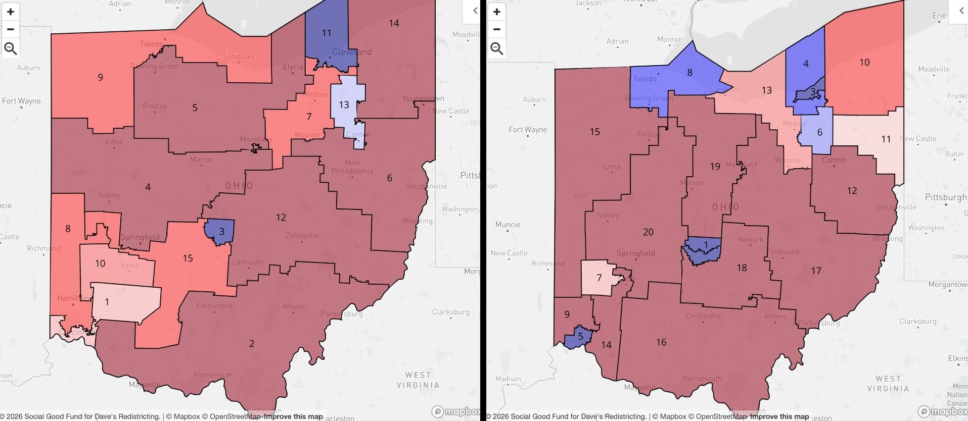
Before this state-by-state review is done I'll have said, "THIS! Yes, this is the worst one" about several of them. Most of them are red states. You know, it's not that long ago Ohio was considered a swing state. In fact, in the year of our lord 2026, there's even a Senate seat that's in toss-up territory.
But just look at the insane map on the left. One solid blue district in Cleveland, one in Columbus, the faintest blue in Akron, and that's it. I hate to get hung up on the partisan lean aspect, but what they did to Cincinnati is an absolute scandal:
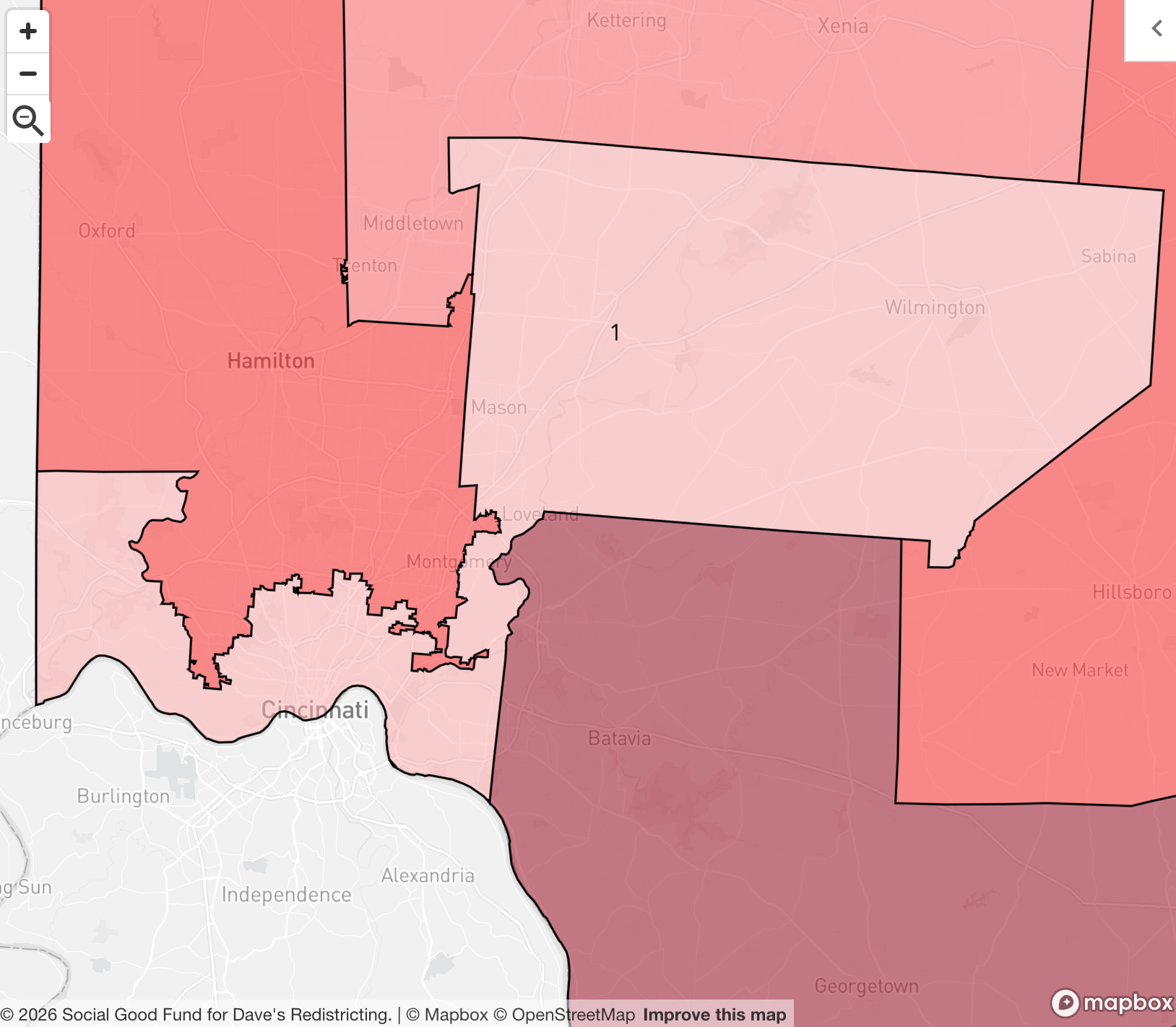
What in god's name is this perversion? Why do they hate Cincinnati? Anyway, behold my 20-district map: still likely a solid majority Republican delegation, but look how well the cities are represented: Cleveland metro gets two, Columbus gets two, Toledo and Akron are checking in, and yes — Cincinnati gets a district that isn't an absolute geographic abomination. This really isn't that hard; people in elected office just have to have principles.
Oklahoma
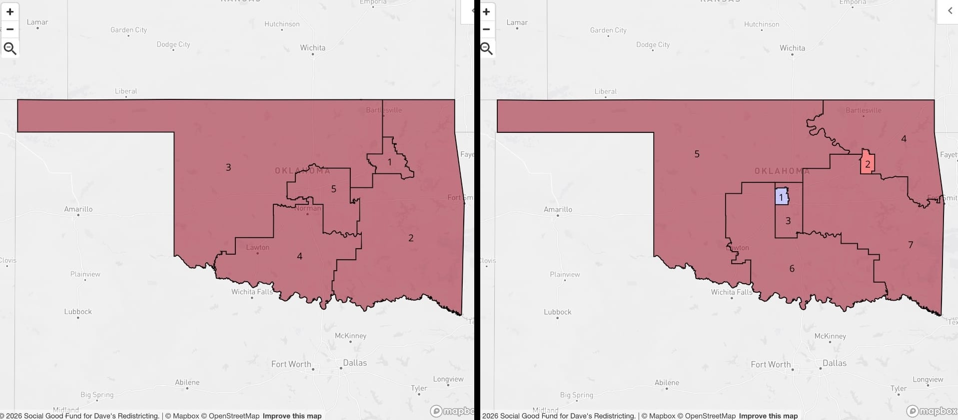
This ends up being one of my favorites. It's easy to look at the adopted Oklahoma congressional map and think, yeah, it's all red — that's about right. But it isn't! This is where uncapping the house and adding a couple districts reveals a lot more nuance. Instead of the state legislature carving up OKC and diluting its (mildly) blue voters into three districts (OK-03, -04, and -05 on the left), we pack them all into their own urban district. I really am party-agnostic on this; I just want proper representation for city dwellers. The map on the right does that for Oklahoma City, AND for Tulsa (new OK-2).
Oregon
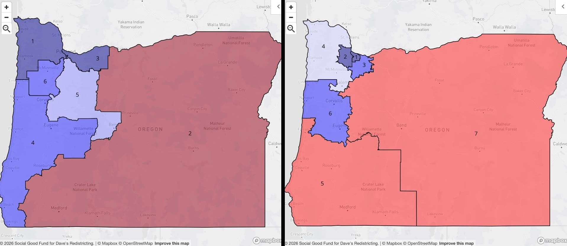
The Beaver State is a bit of a D gerrymander, spreading the Willamette Valley influence into five districts and ceding the Rogue Valley and eastern Oregon to a single red district, OR-02. The proposed map is worse for Democrats...but, I think, better for the constituents of each district. Portland gets its own in OR-01; the suburbs get -02 and -03; Salem, wine country, and the north coast get -04; college gulags Eugene and Corvallis get -06; and the Rogue Valley and eastern Oregon both get their own (-05 and -07). Regrettably, Bend gets shifted back to rural territory. Guess they just need 300,000 more people to move there.
Pennsylvania
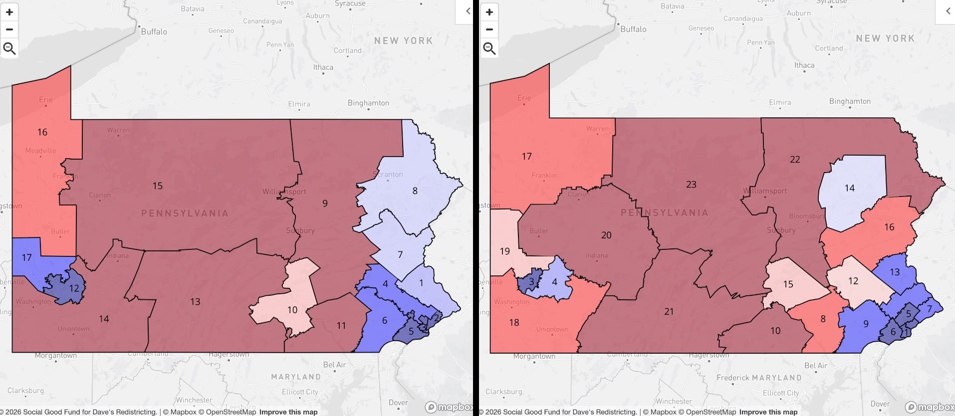
Well, this is embarrassing. Pennsylvania has a D lean of 51.3%, the adopted congressional map is consistent with that, and then I went and managed to flip the likely delegation to slightly red. Again, though, I'm kind of agnostic. The existing map is probably just fine, but the proposed one gets a tighter district around Pittsburgh, and here's Philly:
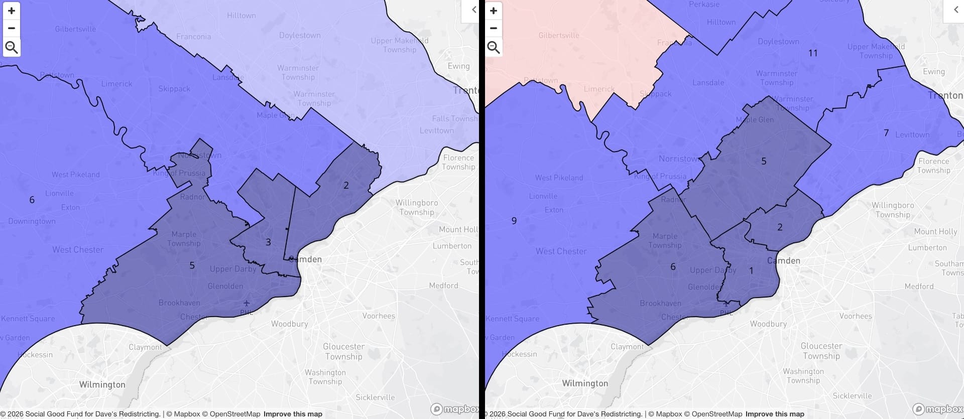
Not all that different, a bit more granularity and urban representation. The existing map doesn't make me mad, though, and that's a lot more than I can say for at least 40 of the others.
Rhode Island
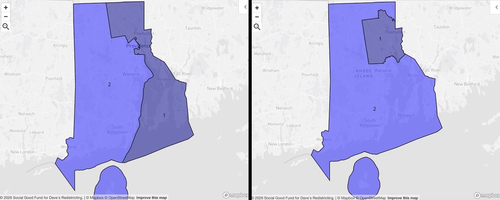
Look, if all you care about is the party affiliation of the delegation you're sending to Washington, then it doesn't really matter how you draw Rhode Island's two districts. I care about having better-defined urban-rural representation all over the U.S., so I'll take the one on the right.
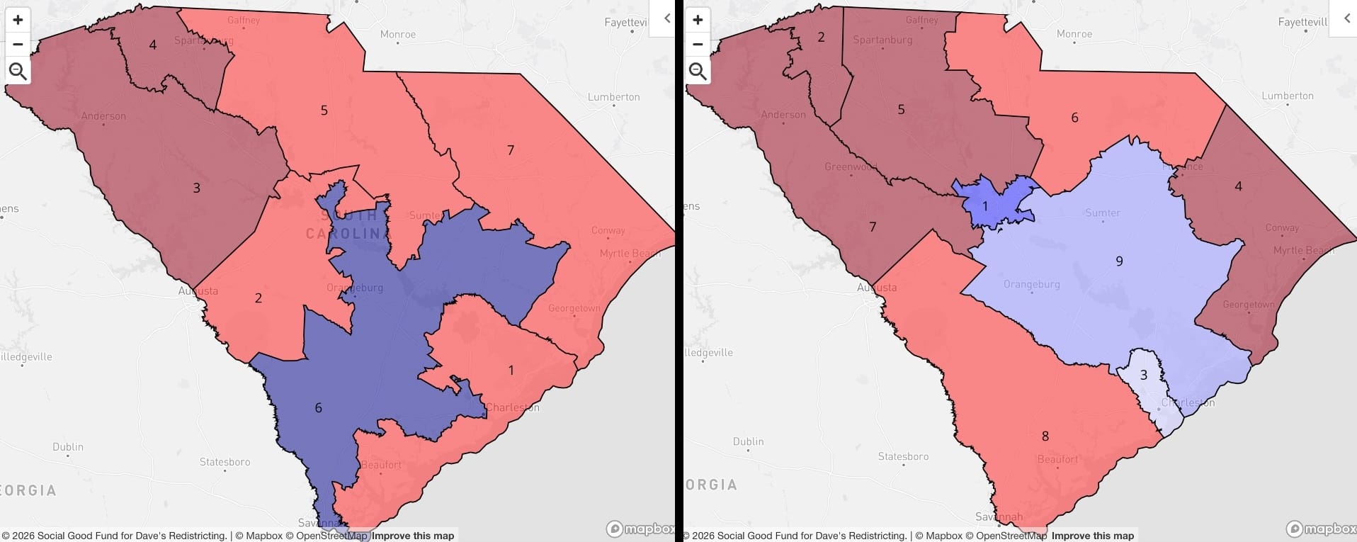
South Carolina
I understand why maps like the one on the left happen. I just don't like it. South Carolina has three different metro areas of around half a million, and each deserves its own district. Instead of...whatever's going on in SC-06 on the left, I've got urban districts for Columbia (SC-01), Greenville (SC-02, and no, not all urban districts are blue, and that's FINE), and Charleston (SC-03). A map can have a lot of red and still be beautiful.
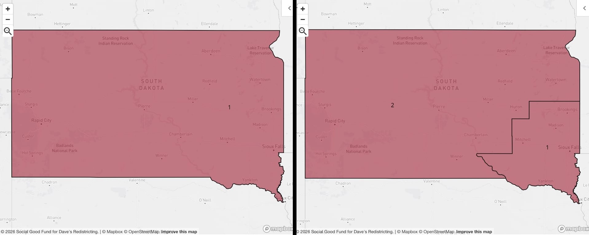
South Dakota
The Wyoming Rule gives South Dakota a second district. The only suspense was in seeing how small a district I could get around Sioux Falls.
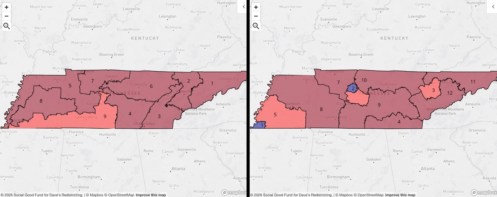
Tennessee
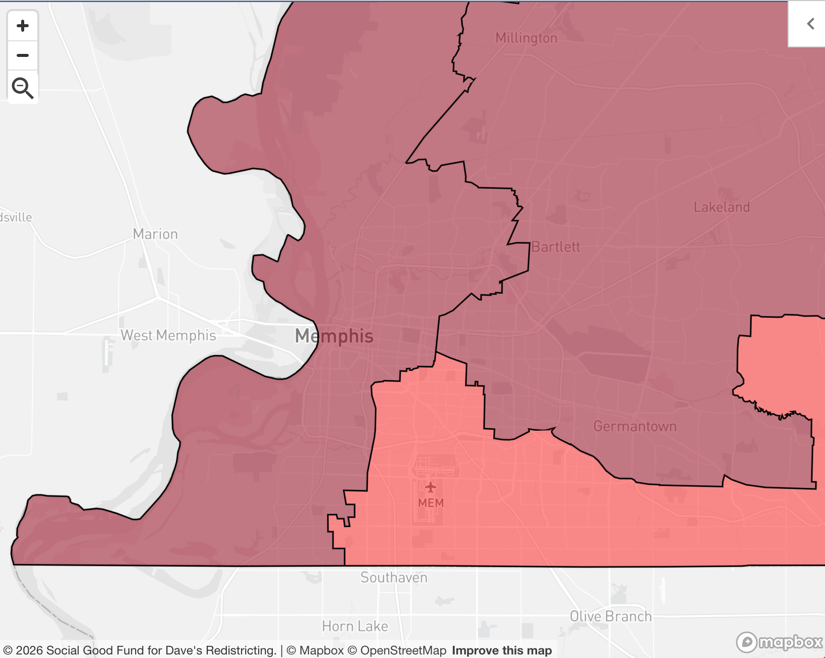
I'm kind of running out of adjectives to use for some of these adopted maps, but for this one I'm going with: shameful. Tennessee is home to two major, diverse, culturally important U.S. cities. Neither gets its own congressional representation under the current map. Look how Nashville gets carved up into five different districts and Memphis into three. (This last gerrymander was especially egregious.)
My proposed map adds three more districts and makes sure two of them, TN-01 and TN-02, are in the heart of the two cities that put Tennessee on the map. Well, I guess you could make an argument for Knoxville, and TN-03 improves its House representation vastly.
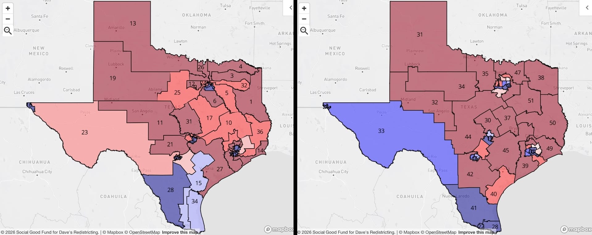
Texas
I mentioned in the overview that, given the current national map, the U.S. House has a significantly more Republican lean than the actual American electorate does. The reasons for this should probably have become clear as we've gone through these maps state by state, but if not, then spending a couple minutes contemplating the adopted Texas map should solve that for you.
Expanding the House and drawing districts using the principles laid out above reveals a much, much more purple state than we've been led to believe. El Paso and west Texas? Blue. The Rio Grande Valley? Blue. (Yes, I mean generically — results vary from election to election, of course.) The big metro areas are worth a closer look, though.
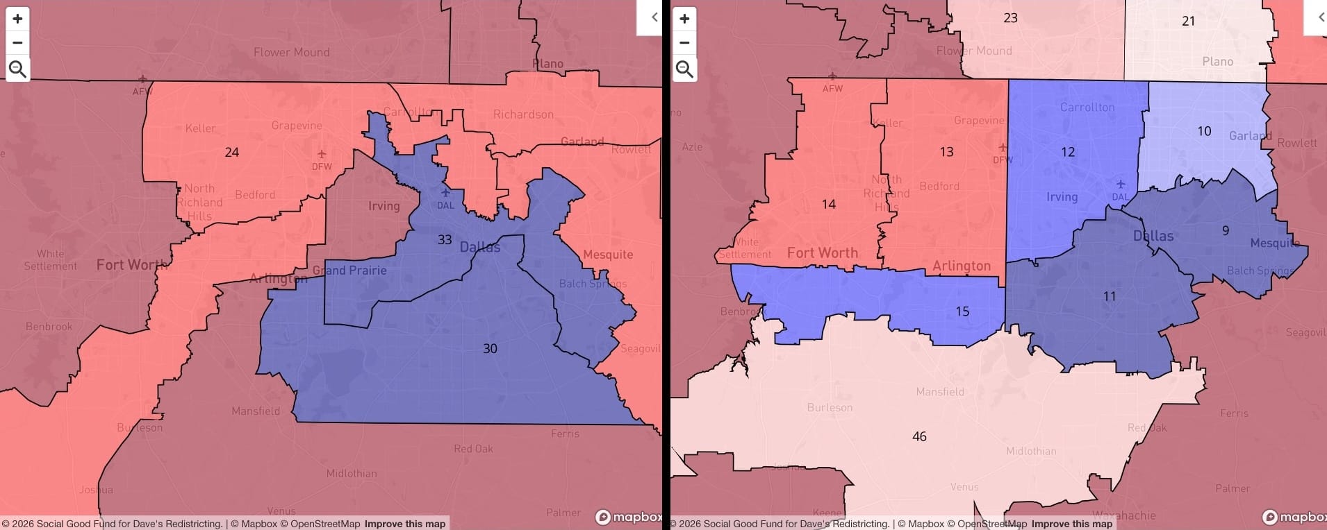
Just insane stuff going on in the DFW on the current map; you can almost feel the sheer malevolent energy that went into drawing it up. Granted, the map on the right is working with smaller districts, but just drawing normal, rational polygons got me five blue districts. Fort Worth, there is good in you. I can sense it.
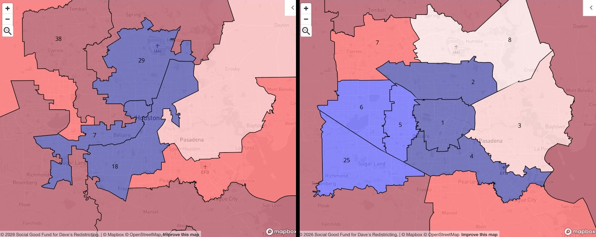
When I see a map like the one on the left, I just want to do a wellness check. Is everything OK in there? Do you need help? A prescription refill, perhaps? There's actually a very cool, very urban U.S. city of about half a million inside the I-610 loop. That city will heretofore be known as TX-01.
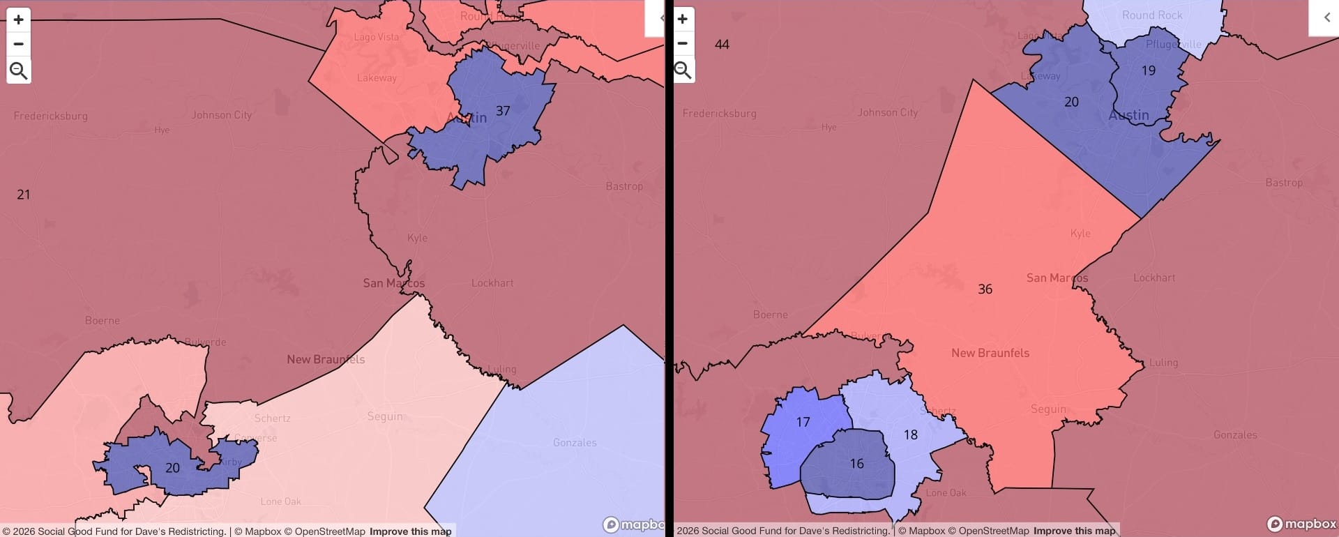
Earlier I mentioned the colossal miscarriage of justice that is the districting around Austin. San Antonio is also bad. What on earth is the shape of that TX-20 district on the left? Is it a hurricane?? Does the Texas legislature have even one iota of shame? I, on the other hand, propose districts whose shapes don't look like natural catastrophes.
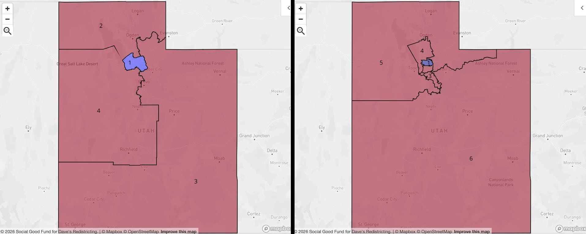
Utah
I added two districts, but I don't even think I improved on Utah's map. It's just a different kind of state.
Vermont
No change. I just hope we don't have to start calling it "The Vermont Rule" someday.
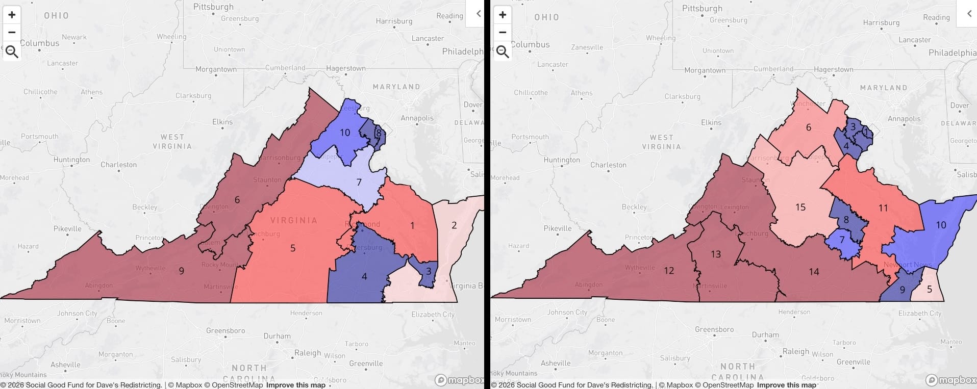
Virginia
The current Virginia map is actually fine on its own merits. I prefer the added granularity around the DC area and the two Richmond-area districts you get with a 575-seat House and an urban-focused approach, but the map on the left is one of the less objectionable out there. But while we're here, let's pour one out for the recently struck down "10-1" Virginia map:
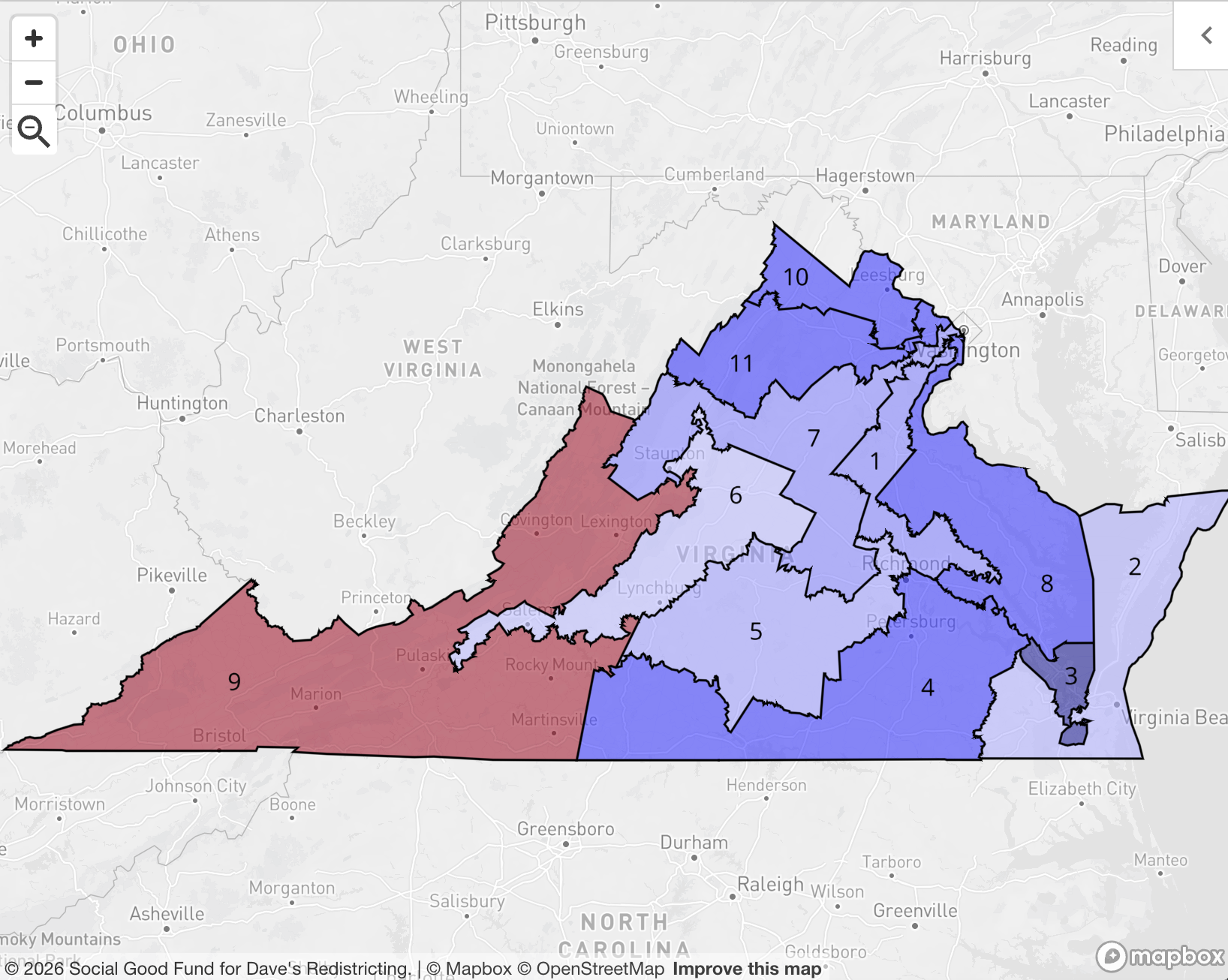
Behold, a map cynical enough to make a red state legislator cry. It's like they took the compact, elegant NOVA districts from my proposed map and went full Stretch Armstrong with them. I can't even hate it; after all, this is, probably, a snapshot of the better world that we're being actively denied.
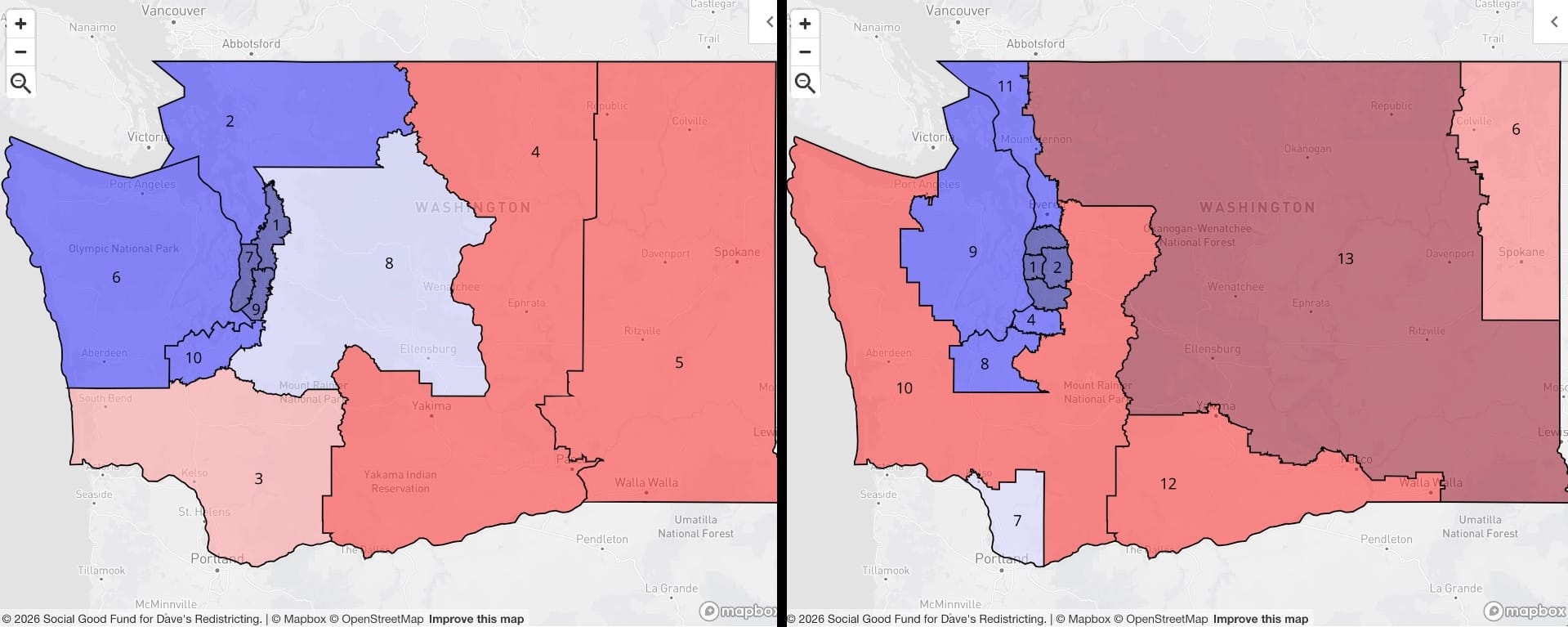
Washington
Another pretty reasonable existing map, but adding districts and making them compact gets you a lot. We can really shrink down existing WA-03 (left) in the southwest to something largely urban: the proposed WA-07 (right) which is comprised mostly of Portland suburbs and Kelso/Longview. I'm a little disappointed we couldn't make Spokane (new WA-06) more compact — it's a metro area of around congressional district size, but a decent chunk of that metro area is in northern Idaho. Alas.
And then, Puget Sound:
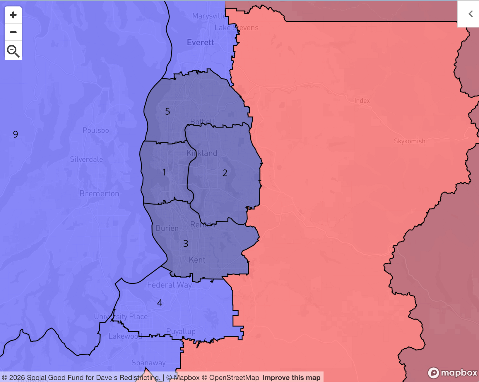
Witness: my masterpiece, the metro area that was tailor-made for this kind of house expansion and redistricting. Inner Seattle? You get a district. East side? You get a district. North Seattle/South Snohomish? South King County? Tacoma? Everyone gets a district. I don't even have to insert an Oprah GIF, it's already playing in your head.
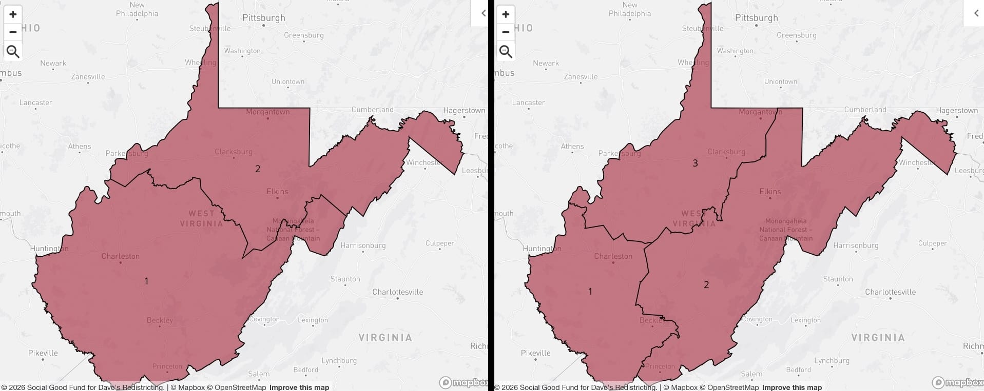
West Virginia
This isn't to slag West Virginia, because I'm 100% sure I would enjoy it if I went to film in like Charleston or Morgantown. But it is kind of funny that you can have an approach that focuses on creating specifically urban and rural districts, and end up with three districts roughly the same size and political lean.
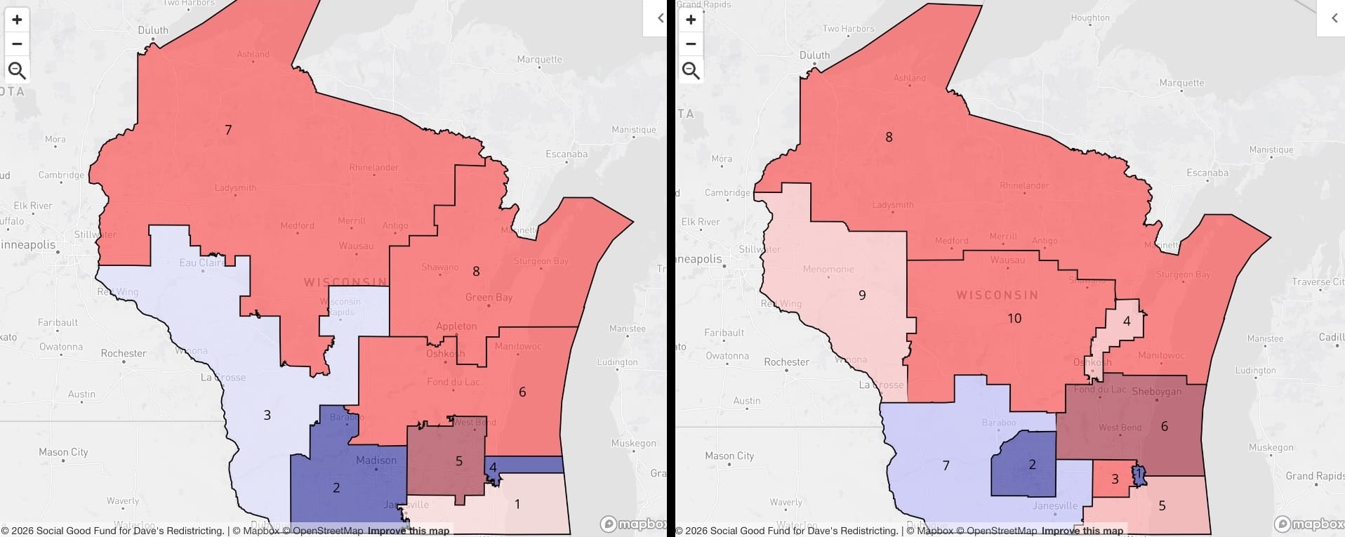
Wisconsin
You know how I've made the point repeatedly that whatever the partisan lean of a state is, the House delegation breakdown tends to be a more extreme version of that lean? Because, math? Well, meet Wisconsin, a.k.a. the drunkest state. The statewide electorate has a slight D lean, but man, I do NOT know how you get a 50/50 house delegation out of this state. Not that I really tried, but once you draw polygons around the city of Milwaukee and Dane County, good luck assembling a majority of blue voters anywhere else. (Although, in 2026? Who knows.)
Wyoming
If you scrolled this far, I salute you.