Ask a City Nerd #2: The Median Is Not the Message

Welcome to Ask a City Nerd. Got a question you want answered? Or a story I can use as a jumping-off point for lengthy digressions on things I wanted to talk about in the first place? Submit it here! Submissions are lightly edited for anonymity and conciseness.
Hi Ray,
I'm a big fan of your videos that address affordability and urbanism together. Makes me feel grateful as a lifelong PA resident that Philly and Pittsburgh always seem to be in the top 10! I've noticed that you typically include rent or home prices in your analyses but not incomes.
Are you aware of the Atlanta Fed's Home Ownership Affordability Monitor? It's my favorite way to look at affordability because it shows the median income household’s capacity to afford the median priced home at the national, metro, or county level. I recommend viewing the "Share of Median Income" parameter instead of "Affordability Index" because it's more intuitive.
Unrelated, but I went to your first talk at Hunter College with The War on Cars and was thankful that the ticket prices were quite reasonable. Looking forward to watching your future weekly videos!
First of all, for those of you who have never experienced one of my in-person events, they basically amount to a guy sitting on stage with a mic talking about transit-oriented development and traffic flow theory. I don't know how much you imagined anyone would charge for that, but I assure you whatever it is is far too much. In fact, it's amazing people pay actual cash for it, let alone their free time on an otherwise lovely evening.
In any case, I don't have much say in ticket prices. The sponsor generally runs that whole side of things, and in Hunter's case, the proceeds are funding fellowships in the urban planning and policy department, and I trust they know best how to maximize for that. Anyway, hope to be back again next year — stay tuned!
Income: not that easy to analyze, it turns out
I'm gonna get to this Atlanta Fed thing because it's worth sharing for anyone who hasn't seen it before, but first I want to be clear that there are countless ways to slice and dice the affordability question, and my analyses do often include some sort of measure of prevailing income. I've used median income in some cases because it's the most obvious, intuitive income metric, but it also has serious limitations, which we'll explore in a minute. I've also looked at affordability for people making minimum wage, which itself varies greatly by city; I've used the 25th percentile income because I wanted something more nuanced than the median; I've even used the Gini Coefficient to approach the income inequality question as directly as possible.
I think these are all important videos (inasmuch as anything I do could be considered important), but crucially, they all perform significantly worse than my basic "affordable urbanism" videos, where I leave income out of the analysis entirely. I have plenty of theories for why this is, and I might get into it at some point, but the bottom line is, when people lose interest in a video and click out of it early, that video gets suggested to potential viewers less often, and therefore depresses watch-hour numbers. So, if you have the impression that I don't make videos that incorporate income into the affordability question, it's literally because YouTube doesn't surface those thumbnails on your home page. Those videos exist; unfortunately, the onus is on you to go find them. YouTube won't do the work for you.
HOAMward bound
Anyway, I like this question because it's an opportunity to introduce, and play around with, a fun (and enormously sobering) web tool, the Home Ownership Affordability Monitor (HOAM) from the Federal Reserve Bank of Atlanta.
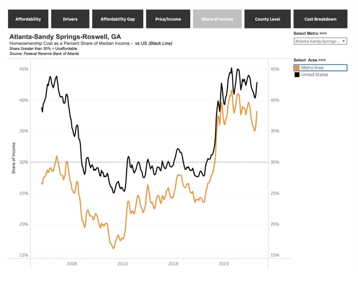
I agree the "Share of Median Income" measure (selected in the figure above) is easier to absorb, so that's where I'm going to focus, but both it and the Affordability Index really measure the same thing: basically, the share of their income that the median-income household has to spend to afford the median-priced housing unit. The Affordability Index simply abstracts the idea a bit by assigning a score of 100 at what's typically considered the "affordability threshold" — 30% of household income spent on housing — with a score over 100 being considered unaffordable, and a score below 100 signifying affordability.
Before we get into some findings, I think it's worth critiquing the whole approach, which relies on medians on both the household income side and the housing expense side. As a simplified way of illustrating broad trends in housing affordability across different geographies, it's fine. But I'm always a little uncomfortable enthroning the median as some sort of normal, relatable state of things when we live in an age of such vast income and wealth inequality. I made this point in my recent video on the homelessness crisis, but it's worth repeating here: the variance in household incomes and the variance in housing costs per square foot, within a given geography, are simply not the same animal. In that video, I used Los Angeles as an example:
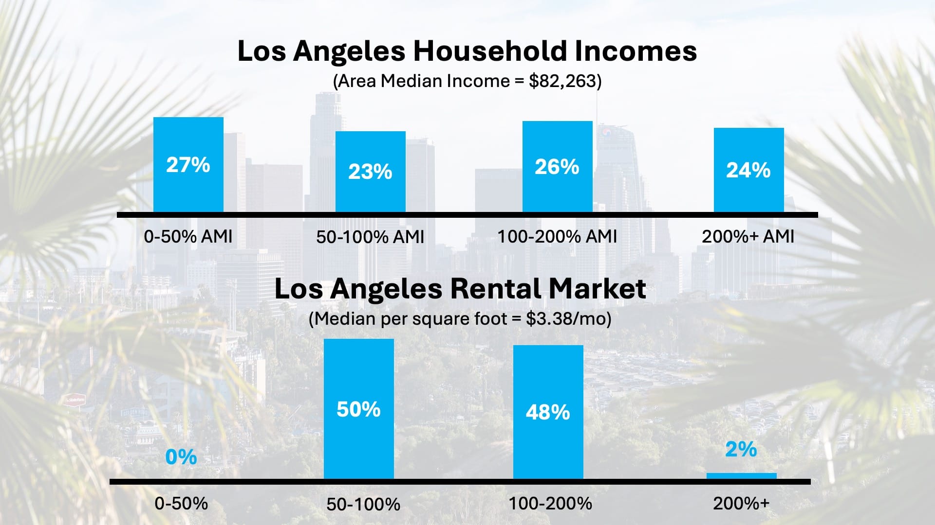
When you split up rent per square foot into four bins, with the three dividing thresholds being half of median, median, and double of median, nearly all of the housing inventory falls in the middle two bins. But when you divide up household incomes the same way, over half of Los Angeles households fall into the outer two bins. I wouldn't want to try to conclude much else from this graphic, but I think it's fair to say that the idea of a median-priced housing product is broadly relatable, but the idea of a median household income is, very often, far from any individual household's day-to-day reality.
Is your city a Pittsburgh or a Los Angeles?
All that said, the Atlanta Fed data is, I think, interesting and useful. At time of writing, a full data set covering months through March 2026 is available, and since I know you're as curious about it as I am, let's look at the best and worst performing metro areas over 500,000 population. Here are the five most ruinously unaffordable metro areas for housing, measured by percentage of median household income required to afford the median-priced housing unit, none of which will come as a surprise:
- Los Angeles-Long Beach-Anaheim, CA (79.1%)
- San Jose-Sunnyvale-Santa Clara, CA (69.8%)
- Urban Honolulu, HI (66.0%)
- New York-Newark-Jersey City, NY-NJ (65.8%)
- San Diego-Chula Vista-Carlsbad, CA (64.6%)
San Francisco-Oakland is seventh, which is shocking until you realize the median household income is around $135,000, compared to a US median of about $82,000. (Maybe it's still shocking.) Now let's look at the five most affordable, according to the Atlanta Fed methodology:
- Pittsburgh, PA (25.8%)
- Scranton--Wilkes-Barre, PA (26.8%)
- Toledo, OH (27.9%)
- Akron, OH (28.0%)
- St. Louis, MO-IL (28.0%)
As someone who makes a lot of videos about cities that seem to be undervalued — cities that often also have a local population that would prefer to keep it that way — I almost feel duty-bound to keep Pittsburgh a secret. But, the data is just...sitting right there. Sorry, yinz.
Now for some bloodless quantitative analysis
What's probably more interesting than making listicles, though, is digging into affordability trends over time. There's been a lot of...discourse lately over whether people's feelings of economic insecurity and spiraling affordability problems are based in reality, or if they're an algorithm-fueled mass hallucination. I think reasonable people can debate this and come to different, nuanced conclusions. But consider the chart for the median metro area (500,000 population or greater) in terms of housing cost burden: amazingly, Washington, D.C. at 39.2%. (Not an inexpensive housing market by any stretch, so the high median income is clearly doing a lot of work here.)
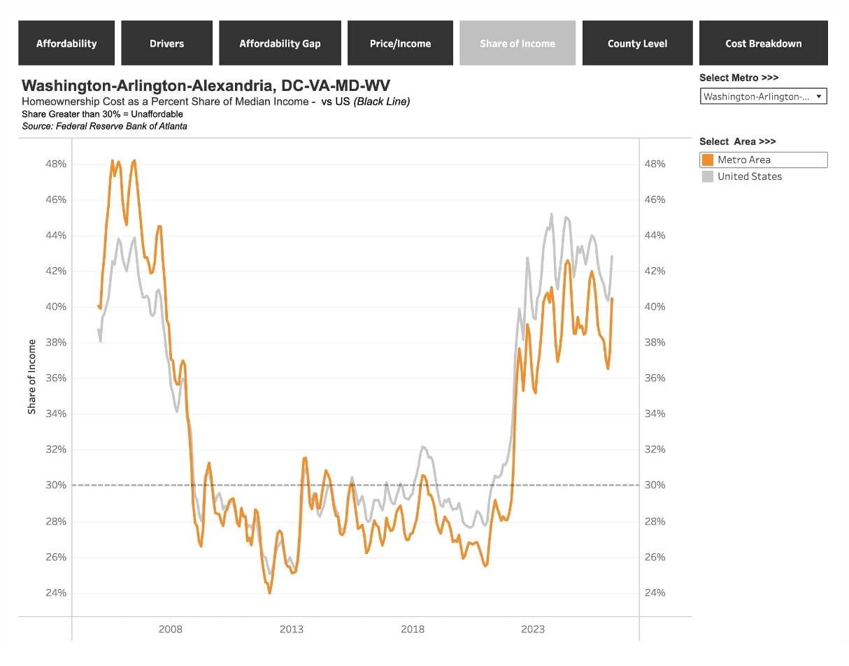
Note that 39.2% is lower than the national median of 43%, which I think tells you just how disproportionately bad the problem is in our most heavily populated cities, including the two largest, New York and L.A., which both appear in the five worst.
But whichever line you look at, the national trend or the trend for the D.C. metro area, the story is the same. Between December 2021 and June 2022, there's a sharp spike in the proportion of their incomes Americans are paying for housing, rising from 28% to 38% for the median household in the DMV, and from 31% to 40% for the median U.S. household. I urge you to not consider these as nine or ten percentage point increases, which seem intuitively less catastrophic, but as 30 to 35% increases in the proportion of their income households have to budget for housing. Worse, as the chart shows, the problem has proved not be temporary: the median housing cost burden as of April 2026 stands at 40% from the D.C. metro, and 43% for the U.S., well in excess of the conventional affordability threshold of 30%.
Now, if you're the type of person whose eyes glaze over when you're looking at charts and data, I've probably already lost you. The metrics are too abstract, you might say, and relying on data comes at the cost of understanding more qualitative aspects of the affordability crisis, empathizing with people's lived experience, etc. Everyone has their own way of absorbing information. I would just argue that analyzing and sharing charts like this isn't bloodless quantitative analysis (or at least it doesn't have to be); on the contrary, when I look at data like this, what I see is quite literally a depiction of not just the economic pain people are feeling, but a deep existential crisis that's embroiling our country right now.
Why — and why now?
One more chart, since we need to address the question of why housing affordability deteriorated so rapidly in the first six months of 2022. The Atlanta Fed has a "Drivers" visualization that illustrates which components have had the most impact on the affordability calculation over time. Here's the D.C. metro area again:
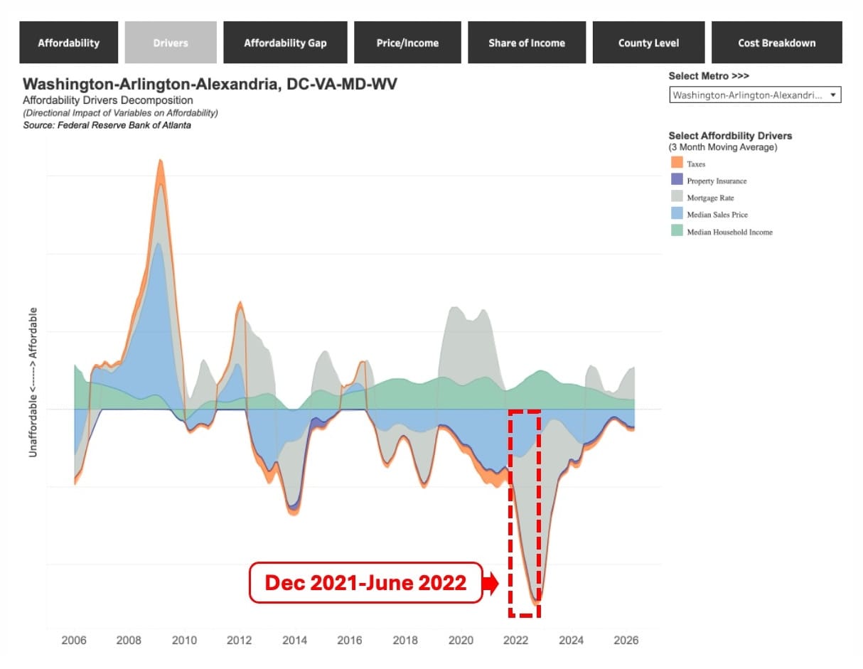
The six months in question are highlighted in the red box. That steep gray trough? That's interest rates, which increased precipitously beginning in late 2021, when the Federal Reserve began a series of hikes aimed at stemming runaway inflation, and the average 30-year mortgage rate spiked from around 3% to around 6%. Again, I encourage you not to think of this as a three percentage-point increase, but a 100% increase in the mortgage rate, and if you need further convincing, google "mortgage calculator," and do some scenario testing. Compound interest is no joke, and the rise in interest rates also helps explain why a lot of new housing construction stopped penciling out. So, ironically, hiking interest rates to stem inflation was, itself, a major driver of the inflation of housing expenses.
The verdict
So, should you consider prevailing incomes when you're trying to assess how affordable a city is? Sure, but it's a bit unclear how useful median household income is, given how much dispersion there is around the median. Plus, there's so much more that goes into affordability, beyond just housing. Yes, you'll likely make significantly more as a schoolteacher in San Francisco than you will in Omaha, but a lot of that income differential will get eaten up by the higher cost of things besides housing. Try going out to dinner in both cities and you'll see what I mean.